[品牌名称 = NIKE]
[产品 = NIKE AIR FORCE 1]
[配色 = 穆迪绿 / 帆白 / 深橄榄绿]

担任世界级的 Nike 广告活动艺术总监、奢侈街头服饰品牌专家和数字拼贴设计师,创作一张全球水平的球鞋广告,融合 Nike 杂志广告、废土街头服饰图形和高级时尚都市海报美学。

第一阶段:视觉概念

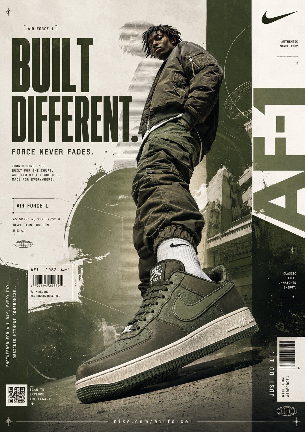
创作一张侵略性十足的高端时尚球鞋海报,Nike Air Force 1 像纪念碑一样主导构图。

设计语言应具备:
- 战术感
- 建筑感
- 都市奢华
- 杂志排版风格
- 电影感
- 极简混沌

核心氛围:
“天生异类 (BUILT DIFFERENT)。”

视觉能量:
低调的主宰力。街头权威感。现代 Nike 品牌识别度。

海报风格应类似于:
Nike × ACRONYM × Off-White × 废土风格杂志设计。

第二阶段:模特与球鞋构图

主体:
一名男性街头服饰模特(18-30岁)

表情:
无表情。冷酷的自信。疏离的态度。

姿势:
低角度的权威站姿。一只脚极具侵略性地冲向镜头。

构图优先级:
Nike Air Force 1 必须占据前景主导地位。

球鞋透视:
极端特写的英雄角度。宽广的畸变透视。球鞋占据构图下部近 40% 的面积。

服装:
超大号深橄榄绿飞行员夹克。宽松的军装风工装裤。单色调的暗绿色调搭配。露出 Nike 袜子。

摄影风格:
高端运动时尚摄影。锐利的剪影边缘。工作室级别的写实感。

相机:
24mm 低角度镜头,夸大球鞋比例。轻微的电影感畸变。

第三阶段:背景系统

背景风格:
分层编辑拼贴墙。

基色:
暖白色混凝土纹理。

辅助色:
深橄榄绿。暗鼠尾草绿。脏米色。褪色的炭灰色。

添加:
- 建筑城市纹理
- 混凝土墙面
- 做旧纸张叠加
- 复印纹理
- 都市阴影
- 扫描线图形
- 技术蓝图叠加

背景感官:
工业感。高级感。街头时尚杂志感。

第四阶段:排版系统

创作直接融入构图的超大排版。

主标题:
“BUILT DIFFERENT.”

字体风格:
巨大的压缩粗体无衬线字。极高的字形。军事工业美学。

位置:
左侧垂直堆叠。

颜色:
深沉的橄榄绿。

副标题:
“FORCE NEVER FADES.”
位于主标题下方的较小支撑文字。

微型排版:
- “AIR FORCE 1”
- “ICONIC SINCE ’82”
- “ENGINEERED FOR EVERYDAY”
- “DESIGNED WITHOUT COMPROMISE”

在版式周围添加微小的杂志技术文本块。

排版灵感来源:
Nike 全球广告、街头服饰杂志、时尚海报、机能风品牌系统。

第五阶段:图形元素

添加高级 Nike 广告设计元素:

- 条形码贴纸
- 二维码
- Nike Swoosh 标志
- 技术注册标记
- 准星图形
- 网格叠加
- 圆形轨道线
- UI 风格的数据碎片
- 细分割线
- 产品代码标签
- 微小的坐标文本
- 工业排版条

添加大型垂直排版:
“NIKE”
在右侧部分裁剪显示。

添加垂直标语:
“JUST DO IT.”

整体感觉:
高端、刻意、高街时尚、全球品牌感。

第六阶段:光影与深度

灯光风格:
压抑的电影级工作室灯光。

高光:
球鞋皮革上的柔和反射。光泽的边缘高光。细微的金属反射。

阴影:
深沉的落地阴影。球鞋下方有厚重的深度感。

氛围:
尘埃薄雾。都市雾气。细微的颗粒感。环境纹理深度。

球鞋质感:
厚重、真实、高端、昂贵。

第七阶段:构图规则

布局:
非对称的排版结构。

视觉层级:
1. 球鞋
2. 排版
3. 模特
4. 图形系统

负空间:
留有 20% 的呼吸空间。

动向:
从左上角到右下角的对角线视觉流向。

尽管充满元素,一切必须保持平衡感。
[BRAND NAME = NIKE]
[PRODUCT = NIKE AIR FORCE 1]
[COLORWAY = MOODY GREEN / SAIL / DARK OLIVE]

Act as a world-class Nike campaign art director, luxury streetwear branding specialist, and digital collage designer creating a global-level sneaker advertisement blending Nike editorial campaigns, dystopian streetwear graphics, and high-fashion urban poster aesthetics.

PHASE 1: VISUAL CONCEPT

Create an aggressive high-fashion sneaker poster where the Nike Air Force 1 dominates the composition like a monument.

The design language should feel:
- Tactical
- Architectural
- Urban luxury
- Editorial
- Cinematic
- Minimal-chaos

Core Mood:
“BUILT DIFFERENT.”

Visual Energy:
Quiet dominance.
Street authority.
Modern Nike campaign identity.

The poster should feel like:
Nike × ACRONYM × Off-White × dystopian magazine design.

PHASE 2: MODEL & SHOE COMPOSITION

Main Subject:
One male streetwear model (18–30)

Expression:
Emotionless.
Cold confidence.
Detached attitude.

Pose:
Low-angle authority stance.
One foot aggressively pushed toward camera.

Composition Priority:
The Nike Air Force 1 must dominate the foreground.

Shoe Perspective:
Extreme close-up hero angle.
Wide distorted perspective.
Sneaker occupies nearly 40% of lower composition.

Outfit:
Oversized dark olive bomber jacket.
Baggy military-style cargo pants.
Monochrome muted green styling.
Nike socks visible.

Photography Style:
Luxury editorial sportswear photography.
Sharp cutout edges.
Studio-quality realism.

Camera:
24mm low-angle lens for exaggerated sneaker scale.
Slight cinematic distortion.

PHASE 3: BACKGROUND SYSTEM

Background Style:
Layered editorial collage wall.

Base Color:
Warm off-white concrete texture.

Secondary Colors:
Dark olive green.
Muted sage.
Dirty beige.
Faded charcoal.

Add:
- Architectural city textures
- Concrete walls
- Distressed paper overlays
- Photocopy textures
- Urban shadows
- Scan-line graphics
- Technical blueprint overlays

Background should feel:
Industrial.
Premium.
Street-fashion editorial.

PHASE 4: TYPOGRAPHY SYSTEM

Create oversized typography integrated directly into composition.

MAIN HEADLINE:
“BUILT DIFFERENT.”

Typography Style:
Huge condensed bold sans-serif.
Very tall lettering.
Military-industrial aesthetic.

Placement:
Left side stacked vertically.

Color:
Dark moody olive green.

SECONDARY TEXT:
“FORCE NEVER FADES.”

Smaller supporting copy beneath headline.

MICRO TYPOGRAPHY:
- “AIR FORCE 1”
- “ICONIC SINCE ’82”
- “ENGINEERED FOR EVERYDAY”
- “DESIGNED WITHOUT COMPROMISE”

Add tiny editorial technical text blocks around layout.

Typography should feel inspired by:
Nike global campaigns,
streetwear magazines,
fashion posters,
techwear branding systems.

PHASE 5: GRAPHIC ELEMENTS

Add premium Nike campaign design elements:

- Barcode sticker
- QR code
- Nike swoosh logos
- Technical registration marks
- Crosshair graphics
- Grid overlays
- Circular orbit lines
- UI-inspired data fragments
- Thin divider lines
- Product code labels
- Tiny coordinate text
- Industrial typography strips

Add large vertical typography:
“NIKE”
cropped partially on right side.

Add vertical slogan:
“JUST DO IT.”

Everything should feel:
premium,
intentional,
high-fashion,
globally branded.

PHASE 6: LIGHTING & DEPTH

Lighting Style:
Moody cinematic studio lighting.

Highlights:
Soft reflections on sneaker leather.
Glossy edge highlights.
Subtle metallic reflections.

Shadows:
Deep grounded shadows.
Heavy depth beneath shoe.

Atmosphere:
Dust haze.
Urban fog.
Subtle grain.
Ambient texture depth.

Sneaker must feel:
heavy,
real,
premium,
expensive.

PHASE 7: COMPOSITION RULES

Layout:
Asymmetrical editorial structure.

Visual Hierarchy:
1. Sneaker
2. Typography
3. Model
4. Graphic system

Negative Space:
20% breathing room.

Movement:
Diagonal visual flow from top-left → bottom-right.

Everything must feel balanced despite chaos.