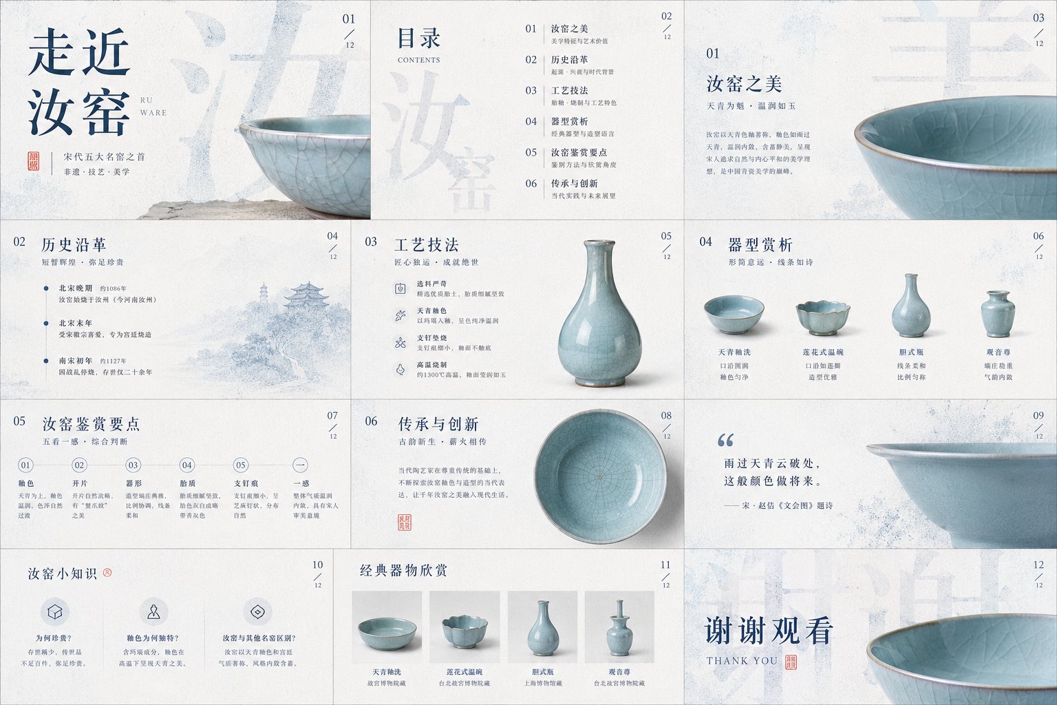
请把画面处理成一种克制、清洁、带有纸面触感的高级视觉:背景不是空白,而是一层有呼吸感的浅色材质,像细腻纸纤维、柔雾、压印或轻微颗粒共同形成的安静底色。让主体内容从这种底色里浮出来,不追求热闹,而追求清晰、轻盈、可触摸的层次。画面可以服务于封面、PPT、信息图、报告页、产品页、海报、榜单或数据可视化,但不要被某一种物件限制;无论主题是产品、人物、空间、食物、知识、商业计划还是年度总结,都要把主体的结构秩序、材质边缘、阴影深度和信息节奏作为真正的视觉核心。

文字要成为画面结构的一部分。使用超大尺度的主标题、关键词、汉字、数字或符号作为背景骨架,让它们占据画面的大面积,但通过颗粒化、网点扩散、轻微模糊、半透明遮挡或边缘溶解变成视觉压力,而不是直接喧宾夺主。前景信息保持精细、干净、可读,像票据、卡片、标签、注释、编号、短句或小型版面系统一样,有明确的行距、层级和留白。允许竖排英文、窄字距注释、编号、小字说明和手写感强调语穿插其中,让文本同时承担阅读、装饰和导视三种功能。标题可以巨大,正文必须克制,强调语要少而准,形成“远看是图形,近看有信息”的双层阅读。

色彩系统以低饱和浅底作为空气和页面温度,以一个深而稳定的主色承担结构、标题、阴影、数据重心或品牌记忆;这个主色可随具体内容转换为更理性、更清洁、更温热、更锋利或更柔软的方向,但必须保持原图那种大面积冷静、少量高识别色、明暗秩序明确的关系。点睛色只占很小面积,用来承接情绪转折、手写标记、重点词、编号、曲线或微小符号;它应随主题改变语义,例如商业内容更果断,学术内容更冷静,节庆内容更温暖,医疗内容更洁净,儿童内容更轻快,但不要把整张画面染成彩色。深色负责结构和重量,浅色负责呼吸,暖色或异色负责瞬间注意力,阴影、透明线框、纸边高光和颗粒质感负责纵深。

版式要有明显的前后景关系:后方是巨大而被柔化的字形或信息块,像一面由文字构成的墙;中景可以有透明椭圆、细线、半透边界或轻微光晕,制造被框选的注意力场;前景则放置最重要的主体或信息模块,让它以轻微倾斜、堆叠、弯曲、错位或悬浮的方式形成真实空间感。不要做普通居中模板,画面重心可以偏右、偏下或被大字推挤出来,左侧或边缘保留一条安静的纵向信息带。留白必须有控制,密集处要像被压缩的纸页或数据层,稀疏处要像空气;所有元素之间保持精密距离,既有商业海报的完成度,也有编辑设计的冷静。

请在下面这个具体任务中,让画面自然长成它需要的形式:根据我提供的主题、文字、数据、品牌、产品或素材,生成一张具有蓝白颗粒文字背景、轻盈前景层次、少量内容响应式点睛色、细腻纸感与高级信息秩序的视觉作品。

本次主题:
走近汝窑

用途:ppt、课件
Please process the image into a restrained, clean, high-end visual style with a paper-like tactile feel: the background is not blank, but a layer of light-colored material that feels like it has 'breath,' like a quiet backdrop formed by fine paper fibers, soft mist, embossing, or slight grain. Let the main content float out from this background, pursuing not hustle and bustle, but clarity, lightness, and a palpable sense of layers. The image can serve for covers, PPTs, infographics, report pages, product pages, posters, rankings, or data visualizations, but do not be limited by any one type of object; whether the theme is a product, character, space, food, knowledge, business plan, or annual summary, treat the subject's structural order, material edges, shadow depth, and information rhythm as the true visual core.

Text should become part of the image structure. Use extra-large scale main titles, keywords, Chinese characters, numbers, or symbols as the background skeleton, letting them occupy large areas of the screen, but turning them into visual pressure through granulation, dot diffusion, slight blurring, translucent occlusion, or edge dissolution, rather than directly stealing the spotlight. Foreground information should remain fine, clean, and readable, like receipts, cards, labels, annotations, numbering, short sentences, or small layout systems, with clear line spacing, hierarchy, and white space. Allow vertical English, narrow-spaced annotations, numbering, small-font explanations, and handwritten-style emphasis to be interspersed, letting text serve the functions of reading, decoration, and navigation simultaneously. Titles can be huge, body text must be restrained, and emphasis should be sparse but accurate, forming a double-layered reading experience where 'it's a graphic from afar, and informative up close.'

The color system uses low-saturation light bases as the air and page temperature, with a deep and stable main color to undertake the structure, title, shadows, data center of gravity, or brand memory; this main color can be converted to a more rational, cleaner, warmer, sharper, or softer direction depending on the specific content, but it must maintain the original image's relationship of large-area calmness, small amounts of high-recognition color, and clear light-and-dark order. Accent colors occupy only a small area, used to handle emotional shifts, handwritten marks, key words, numbering, curves, or tiny symbols; they should change semantics according to the theme, for example, more decisive for business content, calmer for academic content, warmer for festive content, cleaner for medical content, lighter for children's content, but do not dye the entire screen with color. Dark colors are responsible for structure and weight, light colors for breathing, warm or different colors for momentary attention, and shadows, transparent wireframes, paper-edge highlights, and grain textures for depth.

The layout must have a clear foreground and background relationship: in the background, there are huge, softened glyphs or information blocks, like a wall made of text; the mid-ground can have transparent ovals, fine lines, semi-transparent boundaries, or slight halos to create a framed field of attention; the foreground places the most important subject or information module, allowing it to form a real sense of space by being slightly tilted, stacked, bent, misaligned, or suspended. Do not make a standard centered template; the image's center of gravity can be skewed to the right, to the bottom, or pushed out by large characters, keeping a quiet vertical information band on the left or edge. White space must be controlled; where it is dense, it should feel like compressed paper pages or data layers; where it is sparse, it should feel like air; maintain precise distance between all elements, achieving both the completeness of a commercial poster and the calmness of editorial design.

In the specific task below, let the image naturally grow into the form it needs: based on the theme, text, data, brand, product, or material I provide, generate a visual work with a blue-and-white granular text background, light foreground layers, a small amount of content-responsive accent colors, delicate paper feel, and high-end information order. Theme: Approaching Ru Ware. Use: ppt, courseware.