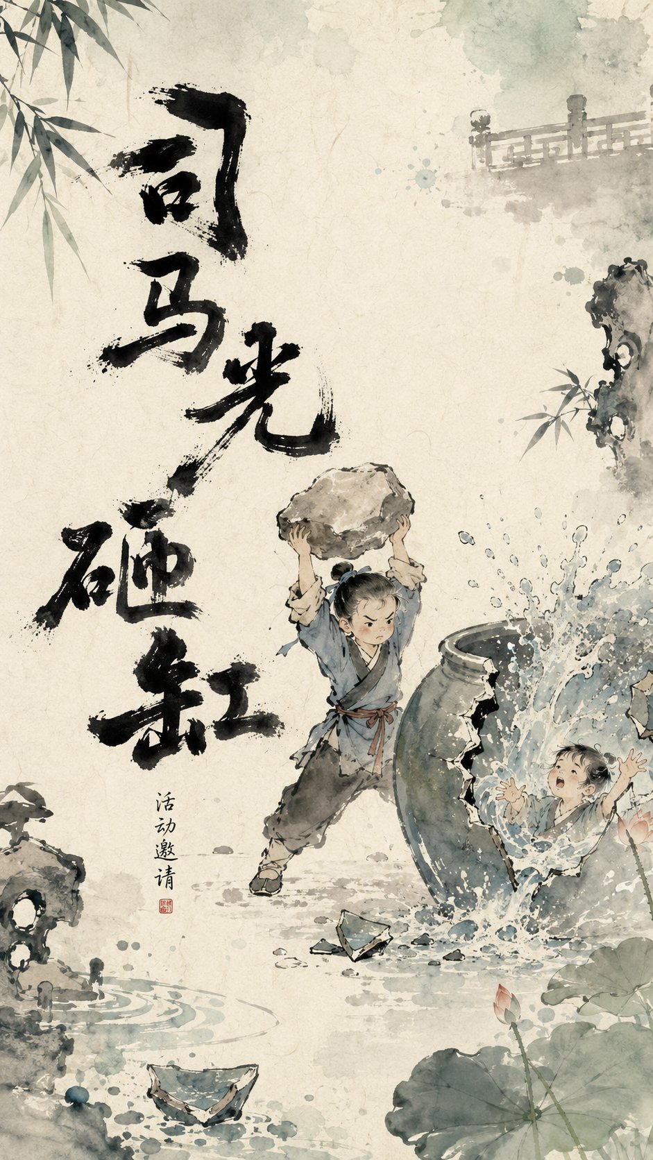
为【主题】设计一张具有东方水墨动画气质的视觉海报。整体采用“重墨立骨、淡彩造境、留白叙事、边缘呼吸”的视觉逻辑。背景为温润宣纸质感,米白、浅青灰、淡水色自然晕染,带轻微纸纹、水痕和墨色扩散。

画面中的核心文字不固定在某一个位置,而是根据主体动作、视线方向、画面留白和视觉重心智能布局。标题可以出现在左侧、右侧、上方、下方、斜向、边缘半露,或围绕主体错落排布。文字位置要像画面自然生长出来的一部分,而不是后期贴上去的排版。

主标题作为浓墨视觉锚点参与构图,具有压住画面、托住主体、引导视线或制造节奏的作用。标题字体为手写重墨书法,笔画厚重、湿润、稚拙、不规则,带飞白、断笔、墨团、渗化和毛糙边缘。字形大小错落,重心略微摇晃,有儿童绘本与中国水墨动画片头的手工感。标题不使用规整商业字体,而要像一组黑色图形符号,与主体、边缘元素、留白空间产生呼应。

画面中心保持适度留白,让主要角色或核心物象轻轻落在纸面空气中。四周加入根据主题变化的淡彩边缘元素,例如【边缘元素】,这些元素从画面外部伸入,只露局部,不完整展示。边缘元素使用水墨淡彩、透明晕染、局部虚化处理,制造画外空间和呼吸感。彩色主要出现在边缘和四角,中心区域保持克制干净。

整体气质诗意、童趣、东方、温润、有手绘感,像一帧会呼吸的中国水墨动画海报。画面要有“重墨文字做骨架,淡彩边缘做气氛,留白区域讲故事”的高级设计感。

————
本次主题:草船借箭
用途(这个文字别写上去):语文课本插画
比例9:16
Design a visual poster with Oriental ink wash animation temperament for the theme [Straw Boats Borrowing Arrows]. The overall visual logic follows 'heavy ink to establish the bones, light colors to create the atmosphere, negative space for narration, and breathing edges.' The background is a warm Xuan paper texture with natural smudging of off-white, light blue-grey, and light watery tones, featuring slight paper grain, watermarks, and ink diffusion.

The core text in the image is not fixed in one position but is intelligently laid out according to the main subject's movement, line of sight, negative space, and visual center of gravity. The title can appear on the left, right, top, bottom, diagonally, partially exposed at the edges, or scattered around the main subject. The text position should look like a naturally grown part of the image, rather than post-production typography pasted on.

The main title serves as a heavy ink visual anchor participating in the composition, playing the role of grounding the image, supporting the main subject, guiding the line of sight, or creating rhythm. The title font is hand-written heavy ink calligraphy, with strokes that are thick, wet, naive, and irregular, featuring 'flying white', broken strokes, ink clumps, seepage, and rough edges. Character sizes are varied, with a slightly swaying center of gravity, possessing the handcrafted feel of children's picture books and Chinese ink wash animation opening titles. The title does not use regular commercial fonts but should be like a set of black graphic symbols, echoing the main subject, edge elements, and negative space.

The center of the image maintains moderate negative space, letting the main characters or core objects rest lightly in the air of the paper. Add light-colored edge elements based on the theme (e.g., [straw boats, arrows in the fog]), which extend in from the outside of the frame, showing only parts and not fully displayed. Edge elements use ink wash light colors, transparent smudging, and local blurring to create off-screen space and a sense of breathing. Color mainly appears at the edges and four corners, while the center area remains restrained and clean.

The overall temperament is poetic, childlike, Oriental, warm, and has a hand-drawn feel, like a breathing frame of a Chinese ink wash animation poster. The image should have a high-end design sense of 'heavy ink text as the skeleton, light color edges as the atmosphere, and negative space to tell the story.'

Theme: Straw Boats Borrowing Arrows
Ratio: 9:16