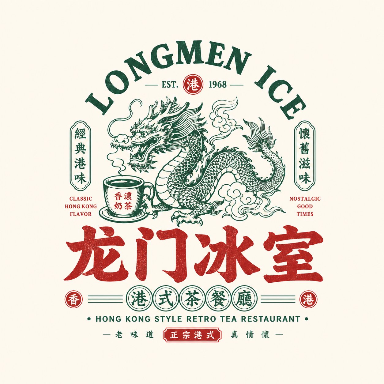
请根据用户输入的【品牌名 / 项目名】【副标题 / 产品名】【类型 / 行业】【地域风味】【品牌定位】【核心关键词】【核心图形】【核心食物 / 品类元素】【情绪气质】【主色调】【辅助色】【画幅比例】,设计一个高完成度的「国潮复古餐饮徽章 Logo / Chinese Retro Food Emblem Logo」。

【用户输入】
品牌名 / 项目名:【品牌名 / 项目名】
副标题 / 产品名:【副标题 / 产品名】
类型 / 行业:【类型 / 行业】
地域风味:【港式 / 粤式 / 湘味 / 川味 / 炭火 / 夜宵 / 茶餐厅 / 烧味 / 海鲜 / 小酒馆等】
品牌定位:【品牌定位】
核心关键词:【复古、国潮、招牌感、老字号感、烟火气、江湖感、新消费感等】
核心图形:【龙 / 凤 / 鹤 / 虎 / 牛 / 蛙 / 鹅 / 鱼 / 龙虾 / 器具 / 图腾 / 吉祥纹样等】
核心食物 / 品类元素:【烧鹅 / 烧烤 / 茶饮 / 龙虾 / 面食 / 牛肉 / 冰室 / 酒馆等】
情绪气质:【热闹、霸气、复古、经典、地方感、烟火气、江湖感、年轻化等】
主色调:【主色调】
辅助色:【辅助色】
画幅比例:【画幅比例】

【核心目标】
这次要设计的是一个真正可用于餐饮品牌的「国潮复古餐饮徽章 Logo」。它不是普通海报,也不是简单卡通插画,更不是只写几个字。请以中文主字标为核心,融合强识别图形、餐饮品类符号、复古中英文排版和完整徽章式结构,打造一个具有门头感、包装感、品牌系统感和传播感的餐饮 Logo。

最终结果应让人一眼感受到:
1. 这是一个餐饮品牌;
2. 它有明确品类和个性;
3. 它像一个成熟的品牌主标,而不是一张装饰性图案。

【设计本质】
这类 Logo 的核心不是单一图形或单一字体,而是以下五层整合:
1. 中文主字标:负责品牌识别;
2. 图形符号:负责记忆点与品类联想;
3. 徽章结构:负责整体完整性;
4. 中英文排版:负责层次感与复古品牌氛围;
5. 颜色系统:负责强化餐饮调性和品类情绪。

【最重要的原则】
1. 中文品牌名必须醒目、清楚、具有招牌感;
2. Logo 必须是一个完整标识,而不是零散元素拼贴;
3. 图形必须与品牌名或品类相关,不能为了装饰而装饰;
4. 英文为辅助,中文为主,英文不能喧宾夺主;
5. 整体必须有餐饮品牌属性,适合门头、菜单、包装和社媒头像;
6. 画面必须有复古感,但不能老气、脏乱或失去现代品牌完成度;
7. 必须有“国潮复古餐饮徽章”的味道,而不是美式卡通或日式商铺字标。

【中文主字标要求】
1. 中文品牌名为绝对主角;
2. 字体要有复古餐饮招牌感、老包装感或国潮标题感;
3. 可以厚重、粗壮、有黑体 / 宋黑 / 商业手写感;
4. 可以做适度变体,但必须清晰可读;
5. 不要极简细字体,不要弱,不要像普通系统字;
6. 需具备门头感和品牌标识感。

【图形系统要求】
请根据【核心图形】与【品类元素】设计一个与品牌高度相关的主图形。
可选方向包括:
- 动物 / 神兽:龙、凤、虎、牛、鹅、鱼、蛙、鹤等;
- 食材 / 菜品:龙虾、烧鹅、牛肉、面碗、火焰、茶杯等;
- 传统图腾:章印、纹样、牌匾、吉祥图案;
- 器具 / 场景符号:烤架、火焰、碗筷、冰室元素等。

图形要求:
1. 要有记忆点;
2. 要与品类和名字有明确关系;
3. 不要做得太复杂写实;
4. 要适合与字标整合为徽章;
5. 可以偏复古插画、版画感、老商标感、国潮线描感。

【徽章结构要求】
请把整体设计成一个完整的“餐饮品牌徽章 Logo”,而不是简单横排。
结构可参考以下方式:
1. 上方英文拱形 + 中央图形 + 下方中文主字标;
2. 中央大图形 + 左右小标签 + 下方副标题;
3. 圆章 / 椭圆章 / 牌匾式构图;
4. 中心主图 + 上下分层文字;
5. 对称排版 + 小图章 + 小圆标系统;
6. 老招牌 / 老商标 / 包装主标式版式。

【中英文排版要求】
1. 中文为主,英文为辅;
2. 英文可用于拱形主标题、品类名、店型说明、口号、年份、ESTD 等;
3. 英文参与构图,增强复古商标感;
4. 英文不需要过多,但要精致、清晰、服务整体结构;
5. 可以使用如:
   - HOUSE
   - TAVERN
   - BARBECUE
   - ROAST GOOSE
   - TEA RESTAURANT
   - LOBSTER HOUSE
   - ESTD / SINCE / CLASSIC / SPECIALTY
6. 不要让英文压过中文,也不要变成纯英文品牌。

【辅助元素要求】
可以加入少量增强品牌系统感的小元素,例如:
- ESTD 年份
- 小圆章
- 小图标
- 小标签
- 小印章
- 地域说明
- 品类说明
- 横线 / 点阵 / 小边框
- slogan 小字

但必须克制,不能把画面做成复杂海报。

【色彩要求】
请根据品牌品类选择更合适的国潮复古餐饮色彩系统,例如:
1. 黑 + 红:烧烤、卤味、烧味、小酒馆;
2. 黑 + 金 / 棕金:老字号、熟食、烧鹅、粤式餐饮;
3. 绿 + 红 + 米白:港式冰室、茶餐厅;
4. 蓝 + 红 + 白:海鲜、龙虾、年轻夜宵餐饮;
5. 黑 + 蓝:更年轻、更理性一点的夜宵或酒馆;
6. 红 + 米白:老长沙粉面、传统小吃等。

要求:
- 色彩有餐饮招牌感;
- 颜色不宜过多,2~4 个主色最稳;
- 高饱和点缀可以增强吸睛度,但必须控制统一性。

【画面呈现要求】
1. 这是独立 Logo 展示图,不是菜单海报;
2. 背景简洁,建议浅灰白、米白、纸白或纯净浅底;
3. Logo 主体完整、清晰、居中;
4. 结构完整、信息有层次;
5. 整体看起来像一个成熟餐饮品牌的主 Logo 提案。

【风格关键词】
国潮复古餐饮徽章 Logo、Chinese Retro Food Emblem Logo、餐饮品牌、复古商标、老招牌、品牌徽章、中英混排、国潮字标、餐饮主标、门头感、包装感、老字号感、新消费餐饮。

【验收标准】
请确保最终结果满足:
1. 一眼看出是餐饮品牌;
2. 中文主字标醒目好认;
3. 图形与品牌名 / 品类有明确关系;
4. 徽章结构完整;
5. 中英文排版有层次;
6. 配色有餐饮品牌气质;
7. 适合门头、菜单、包装、贴纸、外卖头像和社媒主图使用;
8. 整体有“国潮复古餐饮徽章”的成熟商业感。

【输出要求】
请最终输出一个高完成度的「国潮复古餐饮徽章 Logo」。它必须以中文品牌名为核心,结合复古图形、中英文辅助系统、徽章式构图和明确的品类属性,形成一个真正可品牌化、可传播、可落地的餐饮品牌标识。
Please design a high-quality "Chinese Retro Food Emblem Logo" based on the following user-provided configuration:

[User Input]
- Brand Name / Project Name: [Brand Name / Project Name]
- Subtitle / Product Name: [Subtitle / Product Name]
- Type / Industry: [Type / Industry]
- Regional Flavor: [Hong Kong / Cantonese / Hunan / Sichuan / Charcoal Grill / Night Market / Cha Chaan Teng / Roast / Seafood / Bistro, etc.]
- Brand Positioning: [Brand Positioning]
- Core Keywords: [Retro, Chinese Trend (Guochao), Storefront Signboard Vibe, Time-Honored Brand, Hustle & Bustle (Yanhuoqi), Martial Arts/Wuxia vibe, New Consumer Vibe, etc.]
- Core Graphic: [Dragon / Phoenix / Crane / Tiger / Ox / Frog / Goose / Fish / Lobster / Utensils / Totems / Auspicious Patterns, etc.]
- Core Food / Category Element: [Roast Goose / BBQ / Tea Drinks / Lobster / Noodles / Beef / Ice Room / Bistro, etc.]
- Emotional Vibe: [Lively, Domineering, Retro, Classic, Regional, Bustling, Young, etc.]
- Main Color: [Main Color]
- Secondary Color: [Secondary Color]
- Aspect Ratio: [Aspect Ratio]

[Core Objective]
Design a fully-realized "Chinese Retro Food Emblem Logo" ready for dining brands. This is not a poster or simple cartoon illustration, but a professional logo with a strong storefront, packaging, and brand system feel. It should focus on the main Chinese wordmark, integrating memorable graphics, category symbols, retro bilingual typography, and a structured emblem format.

The final design must immediately communicate:
1. It is a dining/food brand;
2. It has a clear category and personality;
3. It feels like a mature brand primary logo rather than a decorative pattern.

[Design Essence]
The logo should integrate five key layers:
1. Chinese Main Wordmark: For brand recognition.
2. Graphic Symbol: For memory points and category association.
3. Emblem Structure: For overall completeness and integrity.
4. Bilingual Typography: For hierarchy and retro brand atmosphere.
5. Color System: To reinforce dining cues and emotional tone.

[Key Principles]
1. The Chinese brand name must be bold, highly legible, and have a "storefront signboard" presence.
2. The logo must be a unified emblem rather than scattered elements.
3. The graphic must relate directly to the brand or food category.
4. English acts as an auxiliary element and must not overshadow the Chinese main text.
5. Highly adaptable for store signs, menus, packaging, and social media avatars.
6. Maintain a vintage, nostalgic vibe without looking messy or outdated.
7. Emphasize a "Guochao (Chinese Retro)" aesthetic rather than American cartoon or Japanese store styles.

[Chinese Wordmark Requirements]
1. The Chinese brand name is the absolute protagonist.
2. Fonts should evoke vintage food signboards, classic packaging, or bold retro headlines.
3. Use bold, heavy fonts like Sans-serif (Heiti), Slab-serif (Songhei), or stylized commercial handwriting.
4. Do not use thin, minimalist, or default system fonts.

[Graphic System Requirements]
Create a highly relevant central graphic based on the [Core Graphic] and [Category Element].
- Options: Mythical beasts/animals (dragon, phoenix, tiger, ox, etc.), core ingredients/dishes (lobster, roast goose, noodles), traditional totems (seals, patterns), or cooking utensils/scenes.
- Graphics should be memorable, stylized (e.g., retro illustration, woodcut, vintage label line art), and easy to integrate into the emblem.

[Emblem Structure Requirements]
Use a cohesive layout, such as:
1. Arched English text on top + central graphic + Chinese wordmark at the bottom.
2. Central main graphic + side badges + subtitle below.
3. Circular, oval, or plaque-style framing.
4. Symmetrical layouts with sub-seals and small stamp details.

[Bilingual Typography Requirements]
- Chinese dominant, English auxiliary (e.g., "HOUSE", "TAVERN", "BARBECUE", "ESTD", "SINCE").
- Use English to construct arches, state categories, or serve as composition borders.

[Color System Requirements]
Select a retro dining palette:
- Black + Red (BBQ, Hotpot, Bistro)
- Black + Gold/Bronze (Time-honored brands, Roast Goose, Cantonese)
- Green + Red + Cream (Hong Kong café/Cha Chaan Teng)
- Blue + Red + White (Seafood, modern night markets)
- Red + Cream (Noodles, traditional snacks)
Keep the palette cohesive, using 2-4 primary colors.

[Presentation Requirements]
- Displayed as a standalone logo mockup on a clean, simple background (light gray, cream, off-white).
- Centered, complete, and professionally structured.