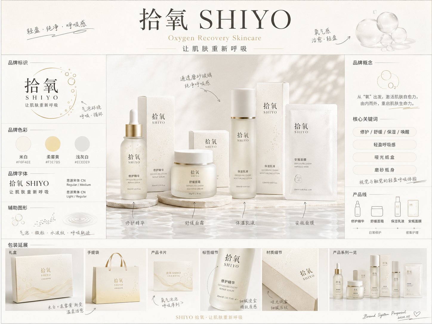
请生成一张【画幅比例】的高完成度「品牌全案概念提案板 / Brand Concept Proposal Board」。

【基础信息】
品牌中文名:【品牌中文名】
品牌英文名:【品牌英文名】
品牌所属品类:【品牌品类】(如护肤 / 香氛 / 洗护 / 彩妆 / 茶饮 / 餐饮 / 宠物 / 家居等)
品牌核心概念:【品牌核心概念】
品牌 slogan:【品牌 slogan】
目标人群:【目标人群】
价格带 / 定位:【品牌定位】
使用场景:【使用场景】
产品线 / 核心产品:【产品线 / 核心产品】

【视觉方向】
整体气质:【整体气质】(如高级、极简、温柔、复古、未来感、自然疗愈、都市感、潮流感等)
主色调:【主色调】
辅助色:【辅助色】
点缀色:【点缀色】
材质关键词:【材质关键词】(如磨砂玻璃、哑光纸盒、压纹纸、烫金、透明亚克力、金属件等)
辅助图形方向:【辅助图形方向】(如几何图形、植物线稿、水波纹、气泡、雾气、线性流动图形、图标系统等)

【画面目标】
这不是普通产品海报,不是电商详情页,也不是单一包装图,而是一张高完成度的「品牌全案概念提案板」。
画面要体现品牌从概念到视觉落地的第一轮整体提案感,适合用于早期视觉方向探索。

【画面内容需要包含】
1. 品牌主标题区:
- 品牌中文名
- 品牌英文名
- slogan
- 一句简洁的品牌概念说明

2. 品牌识别区:
- Logo 方向展示
- 字体气质展示
- 标准色 / 色卡展示
- 辅助图形展示

3. 中央主视觉区:
- 以【核心产品 / 产品线】为中心,展示一组高质感产品包装样机
- 包含主产品、外包装盒、系列组合
- 产品外观、标签、排版、材质统一,具有完整品牌系统感
- 这是整张图的视觉重心

4. 信息说明区:
- 展示产品卖点 / 核心关键词 / 使用场景 / 体验感受
- 信息不要过多堆砌,要简洁、清楚、有提案感
- 以中文为主,英文可作为辅助

5. 应用延展区:
- 展示品牌延展物料,如手提袋、卡片、贴纸、礼盒、宣传卡、菜单、周边、标签、瓶贴、社媒小图等
- 根据品类合理选择,不必机械全部出现

6. 手绘标注区:
- 画面中加入适量手绘感标注、箭头、草图式说明、小注释
- 要有设计师提案板的感觉
- 手写标注要清晰、自然、精致,不要凌乱

【版式要求】
- 整体为横向或竖向品牌提案板版式,推荐【画幅比例】
- 版式具有设计感、品牌感、提案感、杂志感
- 阅读路径清晰:上方品牌信息 → 中央主产品 → 左右信息模块 → 底部延展展示
- 留白合理,不要过空,也不要过满
- 信息模块分布清晰,像专业设计公司提交的概念提案板

【风格要求】
- 画面高级、清晰、干净、有品质感
- 文字尽量清楚、准确、自然
- 不要出现明显乱码,不要低质感,不要廉价电商风
- 不要过度花哨,不要把画面做成普通PPT
- 应呈现真实品牌提案的感觉,而不是简单拼贴

【额外要求】
- 根据【品牌品类】和【品牌核心概念】自动匹配合理的包装形式、视觉元素与应用场景
- 如果用户填写的信息不完整,可以在不偏离方向的前提下做合理补全
- 整体输出应更像“概念提案板 / 视觉方向板”,而不是完整品牌规范手册
Please generate a highly finished "Brand Concept Proposal Board" in [Aspect Ratio].

[Basic Information]
Brand Chinese Name: [Brand Chinese Name]
Brand English Name: [Brand English Name]
Brand Category: [Brand Category] (e.g., Skincare / Fragrance / Hair & Body Care / Cosmetics / Tea & Drinks / Dining / Pets / Home, etc.)
Brand Core Concept: [Brand Core Concept]
Brand Slogan: [Brand Slogan]
Target Audience: [Target Audience]
Price Range / Positioning: [Brand Positioning]
Usage Scenarios: [Usage Scenarios]
Product Line / Core Product: [Product Line / Core Product]

[Visual Direction]
Overall Vibe: [Overall Vibe] (e.g., premium, minimalist, gentle, vintage, futuristic, natural healing, urban, trendy, etc.)
Primary Color: [Primary Color]
Secondary Color: [Secondary Color]
Accent Color: [Accent Color]
Material Keywords: [Material Keywords] (e.g., frosted glass, matte paper box, embossed paper, gold foil stamping, transparent acrylic, metal hardware, etc.)
Supporting Graphics Direction: [Supporting Graphics Direction] (e.g., geometric shapes, botanical line art, water ripples, bubbles, mist, linear flowing graphics, icon systems, etc.)

[Visual Goal]
This is not a standard product poster, an e-commerce detail page, or a single packaging render. It is a highly finished "Brand Concept Proposal Board". The visual should reflect the first-round holistic proposal feeling of the brand's transition from concept to visual realization, ideal for early-stage visual direction exploration.

[Visual Elements to Include]
1. Brand Main Header Area:
- Brand Chinese Name
- Brand English Name
- Slogan
- A concise brand concept statement

2. Brand Identity Area:
- Logo direction display
- Typography styling
- Brand colors / color palette swatches
- Supporting graphics display

3. Central Key Visual Area:
- Centered around the [Core Product / Product Line], showcasing a high-texture product packaging mockup set
- Includes the main product, outer packaging box, and series combination
- Product appearance, labels, typography, and materials should be unified, presenting a complete brand system feel
- This serves as the visual centerpiece of the entire board

4. Information & Description Area:
- Showcase product selling points / core keywords / usage scenarios / sensory experience
- Keep info concise, clear, and presentation-like, avoiding clutter
- Primarily in Chinese, with English as secondary support

5. Brand Collateral Extension Area:
- Display brand collateral mockups, such as shopping bags, cards, stickers, gift boxes, promotional cards, menus, merchandise, labels, bottle stickers, social media tiles, etc.
- Choose reasonably based on the brand category; do not force all items mechanically

6. Hand-drawn Annotations Area:
- Incorporate a moderate amount of hand-drawn style annotations, arrows, sketch-like explanations, and small notes
- Give it the feel of a designer's pitch board
- Handwritten annotations should be clear, natural, refined, and not messy

[Layout Requirements]
- The overall layout is a horizontal or vertical brand proposal board, recommended aspect ratio: [Aspect Ratio]
- The layout should feel designed, branded, presentation-ready, and editorial/magazine-like
- Clear reading hierarchy: brand info at the top -> main product in the center -> information modules on left/right -> collateral extensions at the bottom
- Balanced use of negative space, neither too empty nor too crowded
- Information modules should be clearly distributed, resembling a concept board submitted by a professional design agency

[Style Requirements]
- Premium, clear, clean, and high-quality aesthetic
- Text should be as legible, accurate, and natural as possible
- No obvious gibberish characters, no low-quality textures, no cheap e-commerce styles
- Avoid being overly flashy; do not make it look like a generic PowerPoint slide
- It should present the feel of a real brand pitch rather than a simple collage

[Additional Requirements]
- Automatically match appropriate packaging forms, visual elements, and usage scenarios based on the [Brand Category] and [Brand Core Concept]
- If the information provided by the user is incomplete, reasonably fill in the blanks without deviating from the direction
- The overall output should resemble a "concept proposal board / visual mood board" rather than a complete brand guidelines manual