请根据用户输入的【品牌名 / 项目名】【副标题 / 产品名】【类型 / 行业】【品牌定位】【核心意象】【角色 / 图形设定】【情绪气质】【主色调】【辅助色】【画幅比例】,设计一个高完成度的「治愈系手绘趣味字标 Logo / Healing Hand-drawn Playful Wordmark Logo」。

【用户输入】
品牌名 / 项目名:【品牌名 / 项目名】
副标题 / 产品名:【副标题 / 产品名】
类型 / 行业:【咖啡 / 面包 / 花艺 / 书店 / 杂货 / 民宿 / 旅行 / 文创 / 家居 / 选物店 / 儿童品牌 / 生活方式品牌等】
品牌定位:【品牌定位】
核心意象:【花 / 鸟 / 猫 / 云 / 太阳 / 面包 / 书 / 手 / 小怪物 / 杯子 / 气球 / 家居小物等】
角色 / 图形设定:【一个轻手绘小角色 / 小物件 / 小图形 / 拟人化意象】
情绪气质:【治愈、松弛、温柔、可爱、发呆、幽默、小浪漫、轻怪趣、生活感等】
主色调:【主色调】
辅助色:【辅助色】
画幅比例:【画幅比例】

【核心目标】
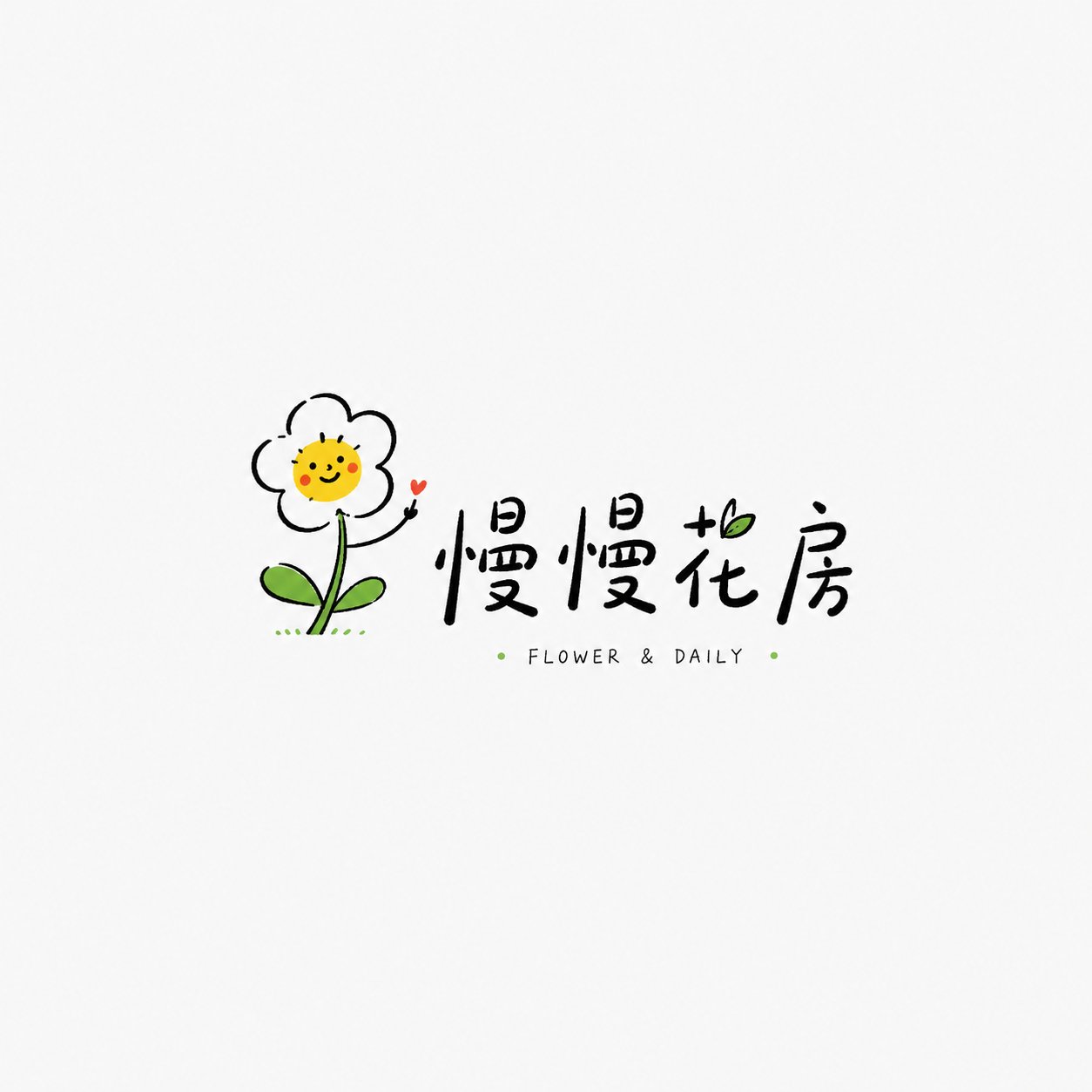
这次要设计的是一个「治愈系手绘趣味字标 Logo」。它不是商业感很重的品牌徽章,也不是高饱和潮玩 IP,不是复杂卡通插画,而是以一个轻巧、有记忆点的小手绘图形为核心,搭配松弛的品牌字标和少量英文 / 小标注,形成一个适合小众品牌、主理人小店、生活方式品牌和文创品牌使用的轻量 Logo。

最终效果应当轻松、干净、有呼吸感、有好感,像一个真实独立小店或生活品牌可以直接使用的 Logo。

【设计本质】
这类 Logo 的重点不是做得复杂,而是做得有情绪、有巧思、有亲和力:
1. 用一个小手绘意象建立第一记忆点;
2. 用松弛自然的字标建立品牌识别;
3. 用大量留白建立轻盈感;
4. 用少量亮色点缀建立温度;
5. 用不完美但有控制的线条建立手绘感;
6. 整体传达治愈、松弛、小众、有生活气息的品牌调性。

【最重要的原则】
1. 图形要简单,但必须有巧思;
2. 文字要轻松自然,不能像普通系统字体直接打字;
3. 整体要有 Logo 性质,不能只是插画;
4. 留白要多,画面不要塞满;
5. 配色要克制,通常以黑色线条为主,搭配 1~2 个点缀色;
6. 风格要松弛,但不能粗糙;
7. 不能低幼,不能像儿童涂鸦,也不能像普通表情包;
8. 要有独立品牌、小店、主理人品牌的审美气质。

【图形 / 角色要求】
请围绕【核心意象】设计一个轻手绘的小图形或小角色。

图形要求:
1. 轮廓简洁,线条轻松;
2. 不追求精密矢量感,允许轻微手绘不规则;
3. 表情或动作要有记忆点;
4. 图形不要太大,不要压过文字;
5. 可以带一点拟人化、幽默感或生活气息;
6. 不要画成复杂插画,不要做成厚重吉祥物。

【字标要求】
1. 品牌名 / 项目名必须清晰可读;
2. 字标应有轻手写感、松弛感、独立小店感;
3. 可以是中文、英文或中英混排;
4. 字距、大小、位置可以略有变化,形成自然节奏;
5. 可以加入少量英文小字、拼音、小 slogan、年份、符号;
6. 文字不能太工业化、太严肃、太厚重;
7. 文字要像和图形一起被设计出来,而不是后期随便打上去。

【构图要求】
整体构图应轻盈、有呼吸感:
1. 图形可以在字标上方、旁边、穿插在字中,或与文字形成小互动;
2. 保持大量留白;
3. 主体不要过满,不要复杂背景;
4. 可以加入极少量小点、短线、弧线、小星星、小手写标注;
5. 整体应像一个独立 Logo,而不是海报或贴纸集合。

【色彩要求】
整体色彩应克制、清爽、有好感:
1. 通常以黑色线稿为主体;
2. 搭配 1~2 个小面积点缀色;
3. 可使用浅黄、天蓝、草绿、番茄红、淡粉、橙色、薄荷绿等;
4. 点缀色要小而准,不要大面积铺满;
5. 避免厚重渐变、复杂阴影、高饱和满版配色;
6. 颜色应像“轻轻点一下”,而不是强行制造冲击。

【质感要求】
1. 线条有手绘感;
2. 形状略带稚拙但可控;
3. 整体干净;
4. 可以有少量不规则笔触;
5. 不要太精密,不要太商业模板化;
6. 不要过度粗糙或凌乱。

【风格关键词】
治愈系手绘趣味字标 Logo、Healing Hand-drawn Playful Wordmark Logo、松弛感手绘图文 Logo、独立小店 Logo、生活方式品牌 Logo、轻手绘、小意象、童趣但不低幼、治愈、可爱、松弛、留白、少量点缀色、手写字标。

【验收标准】
请确保最终结果满足:
1. 图形简单但有巧思;
2. 品牌名清晰可读;
3. 整体有手绘松弛感;
4. 留白充足;
5. 配色克制但有记忆点;
6. 不低幼、不杂乱、不商业模板化;
7. 像真实小众品牌可以使用的 Logo;
8. 具备治愈、趣味、生活方式气质。

【输出要求】
请最终输出一个高完成度的「治愈系手绘趣味字标 Logo」。它必须以轻手绘图形为核心识别,以松弛字标为辅助结构,以少量点缀色和大量留白形成清爽、可爱、治愈、有生活感的品牌标志。
Please design a high-completion 'Healing Hand-drawn Playful Wordmark Logo' based on the user-entered [Brand Name / Project Name] [Subtitle / Product Name] [Type / Industry] [Brand Positioning] [Core Image] [Character / Graphic Setting] [Emotional Temperament] [Main Color] [Secondary Color] [Aspect Ratio].

[User Input]
Brand Name / Project Name: [Brand Name / Project Name]
Subtitle / Product Name: [Subtitle / Product Name]
Type / Industry: [Coffee / Bread / Floral / Bookstore / Grocery / B&B / Travel / Cultural and Creative / Home / Selection Store / Children's Brand / Lifestyle Brand, etc.]
Brand Positioning: [Brand Positioning]
Core Image: [Flower / Bird / Cat / Cloud / Sun / Bread / Book / Hand / Little Monster / Cup / Balloon / Home Small Items, etc.]
Character / Graphic Setting: [A light hand-drawn small character / small object / small graphic / anthropomorphic image]
Emotional Temperament: [Healing, relaxed, gentle, cute, dazing, humorous, slightly romantic, light and quirky, sense of life, etc.]
Main Color: [Main Color]
Secondary Color: [Secondary Color]
Aspect Ratio: [Aspect Ratio]

[Core Goal]
The goal this time is to design a 'Healing Hand-drawn Playful Wordmark Logo'. It is not a heavy commercial brand badge, nor a high-saturation trendy toy IP, nor a complex cartoon illustration, but centered around a lightweight, memorable small hand-drawn graphic, paired with a relaxed brand wordmark and a small amount of English / small annotations, forming a lightweight Logo suitable for niche brands, shopkeepers' small stores, lifestyle brands, and cultural and creative brands.

The final effect should be relaxed, clean, breathable, and likable, like a Logo that a real independent small shop or lifestyle brand can use directly.

[Design Essence]
The key to this type of Logo is not complexity, but emotion, cleverness, and affinity:
1. Establish the first memory point with a small hand-drawn image;
2. Establish brand recognition with a relaxed and natural wordmark;
3. Establish a sense of lightness with plenty of white space;
4. Establish warmth with a small amount of bright color accents;
5. Establish a hand-drawn feel with imperfect but controlled lines;
6. Overall convey a healing, relaxed, niche, and life-oriented brand tone.

[Most Important Principles]
1. Graphics should be simple but must be clever;
2. Text should be relaxed and natural, not like typing directly with common system fonts;
3. The whole thing should have a Logo nature, not just an illustration;
4. There should be a lot of white space, do not fill the screen;
5. Color matching should be restrained, usually based on black lines, paired with 1-2 accent colors;
6. The style should be relaxed but not rough;
7. Not childish, not like children's graffiti, nor like common emojis;
8. It should have the aesthetic temperament of independent brands, small shops, and owner-operated brands.

[Graphic / Character Requirements]
Please design a light hand-drawn small graphic or character around the [Core Image].

Graphic requirements:
1. Simple outline, relaxed lines;
2. Does not pursue a precise vector feel, allows slight hand-drawn irregularities;
3. Expressions or movements must have memory points;
4. The graphic should not be too large and should not overwhelm the text;
5. Can have a bit of anthropomorphism, humor, or sense of life;
6. Do not draw as a complex illustration, do not make it into a heavy mascot.

[Wordmark Requirements]
1. Brand Name / Project Name must be clearly readable;
2. The wordmark should have a light hand-written feel, a relaxed feel, and an independent shop feel;
3. Can be Chinese, English, or a mix of Chinese and English;
4. Letter spacing, size, and position can vary slightly to form a natural rhythm;
5. Small English words, Pinyin, small slogans, years, and symbols can be added;
6. Text cannot be too industrial, too serious, or too heavy;
7. Text should be designed together with the graphic, rather than just typed on later.

[Composition Requirements]
The overall composition should be light and breathable:
1. The graphic can be above the wordmark, beside it, interspersed within the text, or form a small interaction with the text;
2. Maintain a large amount of white space;
3. The main body should not be too full, avoid complex backgrounds;
4. A very small number of dots, short lines, arcs, small stars, and small handwritten annotations can be added;
5. The whole should be like an independent Logo, not a collection of posters or stickers.

[Color Requirements]
The overall color should be restrained, refreshing, and likable:
1. Usually based on black line art;
2. Paired with 1-2 small area accent colors;
3. Light yellow, sky blue, grass green, tomato red, light pink, orange, mint green, etc., can be used;
4. Accent colors should be small and precise, do not fill large areas;
5. Avoid heavy gradients, complex shadows, and high-saturation full-plate color matching;
6. Colors should be like a 'light tap' rather than forcibly creating impact.

[Texture Requirements]
1. Lines have a hand-drawn feel;
2. Shapes are slightly naive but controllable;
3. Overall clean;
4. Can have a small amount of irregular strokes;
5. Not too precise, not too commercial template-like;
6. Not excessively rough or messy.

[Style Keywords]
Healing hand-drawn playful wordmark logo, Healing Hand-drawn Playful Wordmark Logo, relaxed hand-drawn graphic and text logo, independent shop logo, lifestyle brand logo, light hand-drawn, small image, childlike but not immature, healing, cute, relaxed, white space, small amount of accent colors, handwritten wordmark.

[Acceptance Criteria]
Please ensure the final result satisfies:
1. Simple but clever graphics;
2. Clearly readable brand name;
3. Overall hand-drawn relaxed feel;
4. Sufficient white space;
5. Restrained but memorable color matching;
6. Not childish, not messy, not commercial template-like;
7. Like a logo that real niche brands can use;
8. Possesses a healing, playful, and lifestyle temperament.

[Output Requirements]
Please finally output a high-completion 'Healing Hand-drawn Playful Wordmark Logo'. It must use a light hand-drawn graphic as the core identification, with a relaxed wordmark as the auxiliary structure, and form a refreshing, cute, healing, and life-oriented brand logo with a small amount of accent colors and a large amount of white space.