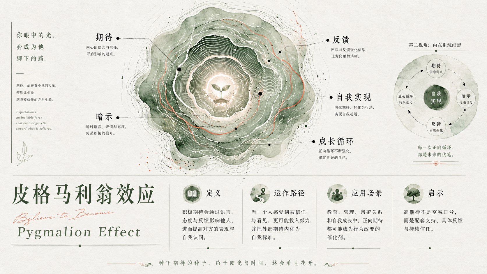
为「[主题]」设计一张高级概念海报。画面核心不是直接描绘主题本身,而是把主题转化为一个有生命感的“内在系统图谱”。使用一个大型有机圆形结构作为主视觉,形态类似树木年轮、水波扩散、指纹纹理、地形等高线、能量漩涡或生命切片;中心有一个清晰的核心点,向外扩散出多层不规则环形纹理,表现主题的成长、积累、演化、扩张与内在秩序。

在圆形系统中设置若干黑色小节点与极细引导线,将「[关键词1]、[关键词2]、[关键词3]、[关键词4]、[关键词5]」作为系统中的精神坐标,而不是普通文字列表。文字标注应像科学图谱、星图、解剖图或研究手稿一样自然分布,形成理性标注与感性纹理之间的反差。

整体风格为极简高级海报、艺术学院毕业展、概念视觉设计、信息图谱、自然纹理实验、抽象品牌视觉。背景使用大量干净留白,带轻微纸张质感,不使用复杂场景。主视觉占据画面上方或中心偏上位置,下方保留安静空间用于标题、短文案或品牌信息。可加入一个微缩版本的小圆形系统作为“局部放大 / 灵魂切片 / 第二视角”,增强宏观与微观的对照。

色彩以「[主色]」为大面积有机底色,叠加少量「[辅色]」作为纹理脉络,用黑色作为文字、节点和细线锚点。色彩应透明、晕染、颗粒化、带手工水彩或版画质感,边缘自然破碎、呼吸感强。整体避免商业模板感,避免过度装饰,避免机械几何,追求感性、理性、生命力和精神性的平衡。

——————
本次主题:心理学知识点讲解

比如:破窗效应
一共9个这种效应

每个画面,在主色 / 排版 / 字体气质 上都多元变化
每个画面关键词 你自己智能安排

文字能 多维度, 多样式属性的,介绍好这个知识点,让人有所收获,被收获满满。

比例16:9
Design a high-end conceptual poster for "[Subject]". The core of the image is not a direct depiction of the subject itself, but transforms the subject into an "Internal System Map" with a sense of life. Use a large organic circular structure as the main visual, with a form similar to tree rings, water ripples, fingerprint textures, topographic contour lines, energy vortexes, or slices of life; there is a clear core point in the center, diffusing outward with multiple layers of irregular ring textures, representing the growth, accumulation, evolution, expansion, and internal order of the theme.

Set several small black nodes and extremely fine guide lines within the circular system, using "[Keyword 1], [Keyword 2], [Keyword 3], [Keyword 4], [Keyword 5]" as spiritual coordinates in the system, rather than an ordinary text list. Text annotations should be naturally distributed like scientific maps, star charts, anatomical diagrams, or research manuscripts, forming a contrast between rational annotations and emotional textures.

The overall style is minimalist high-end poster, art school graduation exhibition, conceptual visual design, information map, natural texture experiment, abstract brand visual. The background uses a large amount of clean white space with a slight paper texture, without using complex scenes. The main visual occupies the upper or center-upper position of the frame, leaving quiet space below for titles, short copy, or brand information. A miniature version of the small circular system can be added as a "partial enlargement / soul slice / second perspective" to enhance the contrast between macro and micro.

Colors use "[Main Color]" as a large-area organic base color, overlaying a small amount of "[Secondary Color]" as texture veins, and using black as anchors for text, nodes, and thin lines. Colors should be transparent, blooming, grainy, with a handmade watercolor or printmaking texture, and edges should be naturally broken with a strong sense of breathing. Overall, avoid a commercial template feel, avoid excessive decoration, avoid mechanical geometry, and pursue a balance of emotion, rationality, vitality, and spirituality.

——————
Current Subject: Psychology knowledge point explanation

For example: Broken Windows Effect
A total of 9 such effects

Each image should have diverse changes in main color / layout / font temperament
Intelligently arrange keywords for each image yourself

Text should introduce the knowledge point from multiple dimensions and multi-style attributes, making people feel they have gained a lot.

Aspect ratio 16:9