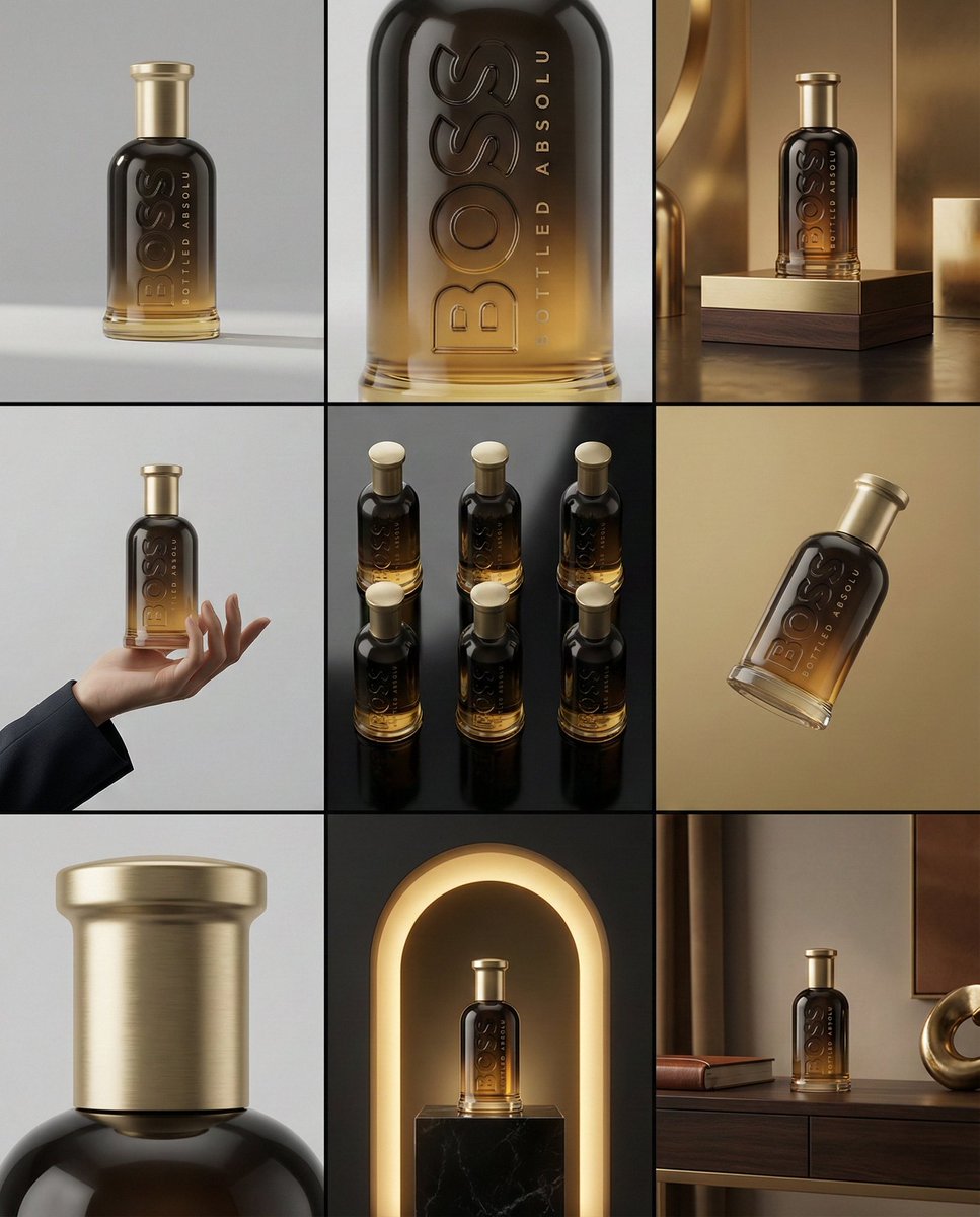
一个简洁的 3×3 [比例] 故事板网格,包含九个等 [比例] 大小的面板,比例为 [4:5]。 请以参考图像作为基础产品参考。在所有九个面板中,保持相同的产品、包装设计、品牌、材料、颜色、比例和整体识别度,与参考图像完全一致。产品在每个画面中都必须清晰可辨。标签、标志和比例必须保持完全相同。 此故事板是用于品牌组合的高端设计师模型展示。重点在于形式、构图、材质和视觉韵律,而非真实感或生活叙事。整体外观应呈现出精心策划、编辑化和设计主导的感觉。 画面 1: 产品在简洁的摄影棚中正面特写。中性背景,平衡构图,产品呈现平静而自信。 画面 2: 特写镜头,焦点集中在产品中部。着重表现表面纹理、材料和印刷细节。 画面 3: 展示参考产品置于一个与品牌和产品类别自然契合的环境中。摄影棚布景灵感来源于产品设计元素和颜色。 画面 4: 产品在使用的场景或在中性摄影棚背景下进行互动。手部和互动元素极少且克制,外观与包装风格相符。 画面 5: 等距构图,从顶部等距角度展示多个产品精确地几何排列。所有产品都以相同的等距顶角放置,间距均匀,简洁、结构化且具有图形感。 画面 6: 产品在与参考图像色调匹配的中性背景上略微倾斜地漂浮。漂浮位置有角度且有意为之,产品在空间中自然漂浮。 画面 7: 极致特写,聚焦于标签、边缘、纹理或材料特性的某个特定细节。 画面 8: 产品置于一个出人意料但具有强烈美学感的场景中,感觉大胆、编辑化且视觉冲击力强。 出人意料但高度风格化的场景。基于摄影棚,由设计师主导。大胆的构图提升品牌形象。 画面 9: 广角构图,展示产品在一个精致的设计师布景中使用。道具简洁,造型考究,与系列其余部分保持一致。 相机与风格: 超高质量的摄影棚图像,具有真实相机的质感。不同画面采用不同的相机角度和构图。受控的景深、精确的照明、准确的材料和反射。照明逻辑、调色板、氛围和视觉语言在所有九个面板中必须保持一致,形成一个连贯的系列。 输出: 一个简洁的 3×3 网格,无边框、无文字、无说明文字、无水印。
A clean 3×3 [ratio] storyboard grid with nine equal [ratio] sized panels on [4:5] ratio. Use the reference image as the base product reference. Keep the same product, packaging design, branding, materials, colors, proportions and overall identity across all nine panels exactly as the reference. The product must remain clearly recognizable in every frame. The label, logo and proportions must stay exactly the same. This storyboard is a high-end designer mockup presentation for a branding portfolio. The focus is on form, composition, materiality and visual rhythm rather than realism or lifestyle narrative. The overall look should feel curated, editorial and design-driven. FRAME 1: Front-facing hero shot of the product in a clean studio setup. Neutral background, balanced composition, calm and confident presentation of the product. FRAME 2: Close-up shot with the focus centered on the middle of the product. Focusing on surface texture, materials and print details. FRAME 3: Shows the reference product placed in an environment that naturally fits the brand and product category. Studio setting inspired by the product design elements and colours. FRAME 4: Product shown in use or interaction on a neutral studio background. Hands and interaction elements are minimal and restrained, the look matches the style of the package. FRAME 5: Isometric composition showing multiple products arranged in a precise geometric order from the top isometric angle. All products are placed at the same isometric top angle, evenly spaced, clean, structured and graphic. FRAME 6: Product levitating slightly tilted on a neutral background that matches the reference image color palette. Floating position is angled and intentional, the product is floating naturally in space. FRAME 7: is an extreme close-up focusing on a specific detail of the label, edge, texture or material behavior. FRAME 8: The product in an unexpected yet aesthetically strong setting that feels bold, editorial and visually striking. Unexpected but highly stylized setting. Studio-based, and designer-driven. Bold composition that elevates the brand. FRAME 9: Wide composition showing the product in use, placed within a refined designer setup. Clean props, controlled styling, cohesive with the rest of the series. CAMERA & STYLE: Ultra high-quality studio imagery with a real camera look. Different camera angles and framings across frames. Controlled depth of field, precise lighting, accurate materials and reflections. Lighting logic, color palette, mood and visual language must remain consistent across all nine panels as one cohesive series. OUTPUT: A clean 3×3 grid with no borders, no text, no captions and no watermarks.