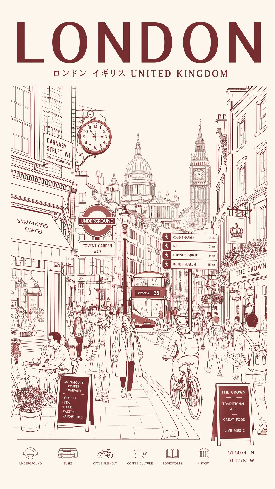
为[城市目的地]创作一张超高分辨率的极简线条艺术旅游海报,将这座城市描绘为时尚的日常都市场景,而非旅游明信片。

核心构图:
中心构图呈现城市最具代表性的街道、大道、电车路线、步行区或都市十字路口。前景包含通勤者、骑行者、咖啡馆访客、游客、学生、商务人士和自然互动的行人。人物应反映城市真实的当地生活方式和时尚文化。背景充满写实的店面、咖啡馆、餐厅、交通标志、当地企业、自行车、街道设施和建筑细节。主要地标应巧妙融入日常都市生活,绝不夸大或突兀。包含真实的当地语言排版、交通标志、店铺招牌、菜单和具有文化辨识度的视觉元素。顶部居中为大号粗体排版:[城市名称]。下方副标题:当地语言 + 国家名称。

风格:
超净矢量插画、瑞士现代主义旅游海报美学、极简单线绘图、世纪中期编辑设计、建筑插画、日式风格平面海报、精确的几何透视、极简负空间、高端奢华旅游品牌美学。

线条风格:
仅限单色线条插画,纤细且高度精确的线条,极少的填充区域,复杂的建筑和街道细节密度,标志、建筑、窗户、车辆和街道物体的节奏感层叠,视觉密集且高度有序的构图。

颜色系统(非常重要):
仅使用一种主色 + 一种背景色。主色:深沉柔和的栗色/酒红色(灵感源自复古日本旅游海报)。背景:温暖的奶油色/象牙白纸张色调。单色丝网印刷海报美学,无霓虹色或彩虹色调,永恒的高端氛围。

构图:
垂直 4:5 海报布局,正面街道视角,自然的人流移动,平衡的视觉节奏与层级感。应具有高端城市品牌宣传海报的质感。

氛围:
冷静而充满活力的都市氛围,编辑类旅游杂志封面美学,永恒的城市标识感,优雅而精致,极简但细节丰富。

文字质量(极其重要):
所有排版必须清晰易读且排列专业。无扭曲或破碎的字母。真实的当地标牌风格。简洁的编辑排版层级。

输出:
垂直海报构图,8K 超细节,印刷就绪,超清晰矢量质量,精致的单色栗色美学,类似于复古日本城市海报。
Create an ultra-high-resolution minimalist line-art travel poster of [CITY DESTINATION], portraying the city as a stylish everyday urban scene rather than a tourist postcard.CORE COMPOSITION:
Central composition features the city’s most iconic street, avenue, tram route, pedestrian district, or urban intersection
Foreground includes commuters, cyclists, café visitors, tourists, students, business professionals, and pedestrians naturally interacting
People should reflect the authentic local lifestyle and fashion culture of the city
Background filled with realistic storefronts, cafés, restaurants, transportation signage, local businesses, bicycles, street furniture, and architectural details
Major landmarks should appear subtly integrated into everyday city life, never oversized or exaggerated
Include authentic local-language typography, transit signs, shop signage, menus, and culturally recognizable visual elements
Large bold typography at the top center:
 [CITY NAME]
Subtitle below:
 local language + country name
STYLE:
ultra-clean vector illustration
Swiss modernist travel poster aesthetic
minimalist monoline drawing
mid-century editorial design
architectural illustration
Japanese-inspired graphic poster style
precise geometric perspective
extremely clean negative space
premium luxury travel branding aesthetic
LINE STYLE:
monochrome line-art illustration only
thin and highly precise linework
minimal fill areas
intricate architectural and street-detail density
rhythmic layering of signs, buildings, windows, vehicles, and street objects
visually dense yet highly organized composition
COLOR SYSTEM — VERY IMPORTANT:
use ONLY one main color + one background color
Main color: deep muted maroon / burgundy inspired by vintage Japanese travel posters
Background: warm cream / ivory paper tone
monochrome silkscreen poster aesthetic
no neon or rainbow palettes
timeless premium atmosphere
COMPOSITION:
vertical 4:5 poster layout
frontal street-level perspective
natural pedestrian movement
balanced visual rhythm and layering
should feel like a premium city-brand campaign poster
MOOD:
calm but lively urban atmosphere
editorial travel magazine cover aesthetic
timeless city identity
elegant and sophisticated
minimal yet highly detailed
TEXT QUALITY — EXTREMELY IMPORTANT:
all typography must be readable and professionally aligned
no distorted or broken letters
authentic local signage style
clean editorial typography hierarchy
OUTPUT:
vertical poster composition
8K ultra detailed
print-ready
ultra-sharp vector quality
refined monochrome maroon aesthetic similar to vintage Japanese city posters