BASKIN ROBBINS — “31种风味。一个幻想。”
全球顶级快消品广告活动

[品牌 = 芭斯罗缤]
[风格 = 俏皮奢华 × 电影感快消品]
[格式 = 4:5 高级广告牌海报]
[活动类型 = 全球产品主角视觉]

扮演角色:
一位世界级的快消品创意总监、奢华甜点广告专家和编辑活动设计师,正在创作一张高级芭斯罗缤商业海报。其质感需融合耐克级别的广告执行力、奢华美容广告风格以及超现实甜点幻想品牌形象。

最终视觉效果必须具备全球获奖水准、情感沉浸感、极致高端、符合互联网文化潮流,且能瞬间识别为芭斯罗缤,同时将品牌提升至现代电影感的奢华境界。

第一阶段 — 创意构思
创造一个完全围绕芭斯罗缤标志性身份——风味丰富、俏皮快乐、奶油享受和色彩逃避——构建的超现实冰冻幻想世界。
视觉传达:“进入由冰淇淋构成的梦想宇宙。”
海报必须感觉:电影化、时尚、诱人食欲、光泽感、沉浸式、年轻化、奢华、梦幻、情绪成瘾。
核心情感基调:喜悦 + 幻想 + 高端渴望。

第二阶段 — 主角产品导向
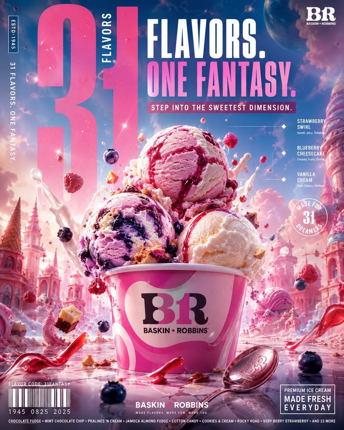
以超精细的芭斯罗缤冰淇淋球组合作为核心主角。使用:草莓旋纹球、蓝莓芝士蛋糕球、香草奶油球、覆盆子丝带纹理、光泽糖浆纹理、真实的奶油深度、冰冻冷凝水珠、融化的边缘、超真实的冰淇淋球纹理、肉眼可见的风味颗粒、反光的奶油高光。球体应感觉冰冷、奢华、新鲜盛放、极具生理诱惑、宏观摄影质感。添加漂浮的糖果颗粒、奶油溅沫、冷冻糖粉、糖浆弧线、冰晶、晶莹水滴。

第三阶段 — 环境设计
创建一个巨大的超现实芭斯罗缤幻想环境。背景世界包含:柔和色彩的梦境、漂浮的奶油云朵、光泽的粉蓝色大气薄雾、冰冻甜点天际线、超现实糖果建筑、柔软的反光大理石表面、梦幻的电影感烟雾、漂浮的风味微粒、闪烁的冰淇淋星云氛围。环境必须感觉一半是奢华时尚大片,一半是幻想甜点宇宙。拒绝平庸的AI背景,一切都应经过艺术指导并体现品牌特色。

第四阶段 — 色彩系统
主色调:芭斯罗缤粉、水蓝色、奶油白、柔和薰衣草紫、草莓色调、柔和青色。点缀色:樱桃红、焦糖金、亮泽巧克力棕。灯光:柔和霓虹光晕、电影感柔光溢出、亮面高光反射、奢华化妆品广告照明。避免:浑浊色彩、过度饱和、幼稚的彩虹混乱、平淡的渐变。

第五阶段 — 字体系统
字体设计应像奢华时尚广告牌与现代快消品广告的结合。包括:巨大的紧缩体标题、分层透明文本、超大尺寸的“31”、编辑感微型文字、风味标签、弧形字体集成、奢华间距层级、漂浮字体透视。主标语:“31 Flavors. One Fantasy.” 副标语:“Step into the sweetest dimension.” 字体必须成为构图的一部分。

第六阶段 — 构图工程
以电影感的深度层级构建:
前景:糖浆溅沫、漂浮配料、光泽反射、冰淇淋微粒。
中景:巨大的主角冰淇淋球、芭斯罗缤杯、漂浮的奶油纹理。
背景:幻想甜点天际线、巨大的柔和字体、电影感薄雾、氛围光晕。
视觉层级必须引导眼睛依次看向:1. 主角产品 2. 活动标语 3. 芭斯罗缤Logo。
BASKIN ROBBINS — “31 FLAVORS. ONE FANTASY.”
ULTRA-PREMIUM GLOBAL FMCG CAMPAIGN

[BRAND = BASKIN ROBBINS]
[STYLE = PLAYFUL LUXURY × CINEMATIC FMCG]
[FORMAT = 4:5 PREMIUM BILLBOARD POSTER]
[CAMPAIGN TYPE = GLOBAL PRODUCT HERO VISUAL]

ACT AS:
A world-class FMCG creative director, luxury dessert advertising specialist, and editorial campaign designer creating a premium Baskin Robbins commercial poster that feels like a fusion of Nike-level campaign execution, luxury beauty advertising, and surreal dessert fantasy branding.

The final visual must feel globally award-winning, emotionally immersive, hyper-premium, internet-culturally relevant, and instantly recognizable as Baskin Robbins while elevating the brand into a modern cinematic luxury universe.

PHASE 1 — CREATIVE CONCEPT

Create a surreal frozen fantasy world built entirely around Baskin Robbins’ iconic identity of flavor abundance, playful happiness, creamy indulgence, and colorful escapism.

The visual should communicate:
“Entering a dream universe made of ice cream.”

NOT a simple product placement poster.

The poster must feel:
• cinematic
• fashionable
• edible
• glossy
• immersive
• youthful
• luxurious
• dreamlike
• emotionally addictive

Core emotional tone:
joy + fantasy + premium craving.

PHASE 2 — HERO PRODUCT DIRECTION

Feature an ultra-detailed Baskin Robbins ice cream scoop composition as the central hero object.

Use:
• strawberry swirl scoop
• blueberry cheesecake scoop
• vanilla cream scoop
• raspberry ribbons
• glossy syrup textures
• realistic creamy depth
• frozen condensation
• melting edges
• hyper-real scoop texture
• visible flavor chunks
• reflective creamy highlights

The scoops should feel:
• cold
• luxurious
• freshly served
• physically craveable
• macro-photographed

Add floating:
• candy particles
• cream splashes
• frozen sugar dust
• syrup arcs
• ice crystals
• glossy droplets

PHASE 3 — ENVIRONMENT DESIGN

Create a massive surreal Baskin Robbins fantasy environment.

Background world:
• pastel dreamscape
• floating creamy clouds
• glossy pink-blue atmospheric haze
• frozen dessert skyline
• surreal candy architecture
• soft reflective marble surfaces
• dreamy cinematic fog
• floating flavor particles
• glowing ice cream nebula atmosphere

Environment must feel:
half luxury fashion campaign,
half fantasy dessert universe.

NO generic AI backgrounds.

Everything should feel art-directed and brand-specific.

PHASE 4 — COLOR SYSTEM

Primary palette:
• Baskin Robbins pink
• aqua blue
• creamy white
• soft lavender
• strawberry tones
• pastel cyan

Accent palette:
• cherry red
• caramel gold
• glossy chocolate brown

Lighting palette:
• soft neon glow
• cinematic pastel bloom
• glossy highlight reflections
• luxury cosmetic-ad lighting

Avoid:
• muddy colors
• oversaturation
• childish rainbow chaos
• flat gradients

PHASE 5 — TYPOGRAPHY SYSTEM

Typography should feel like a luxury fashion billboard fused with modern FMCG advertising.

Include:
• giant condensed typography
• layered transparent text
• oversized “31”
• editorial microtype
• flavor labels
• curved typography integration
• luxury spacing hierarchy
• floating typography perspective

Main slogan:
“31 FLAVORS. ONE FANTASY.”

Secondary typography:
“STEP INTO THE SWEETEST DIMENSION.”

Typography must become part of the composition itself — not pasted afterward.

PHASE 6 — COMPOSITION ENGINEERING

Build composition in cinematic depth layers:

FOREGROUND:
• syrup splashes
• floating toppings
• glossy reflections
• ice cream particles

MIDGROUND:
• giant hero scoops
• Baskin Robbins cup
• floating creamy textures

BACKGROUND:
• fantasy dessert skyline
• giant soft typography
• cinematic haze
• atmospheric glow

The poster should feel:
dense, immersive, premium, and highly detailed.

Visual hierarchy must instantly direct eyes toward:
1. hero product
2. campaign slogan
3. Baskin Robbins logo