请根据我上传的门店照片,生成一张竖版 3:4 的《半写实手绘打卡门店海报》。

品牌 / 系列标题:【__________】
店名:【__________】
门店类型:【__________】
海报模式:【活动引流版 / 氛围展示版】
门店主题:【__________】
主文案:【__________】
权益 / 礼品 / 体验内容:【__________】
主色:【__________】
辅色:【__________】
点缀色:【__________】
门店风格方向:【__________】
行业装饰元素:【__________】

请以我上传的真实门店照片作为核心参考,不要重新虚构一家店。需要保留原门店的主要识别特征,包括门店外立面、门头招牌位置、门窗结构、入口关系、橱窗位置和整体建筑比例。可以适度美化门面、优化配色、增加装饰、改善橱窗陈列和门口氛围,但不能把门店改成完全不同的建筑。

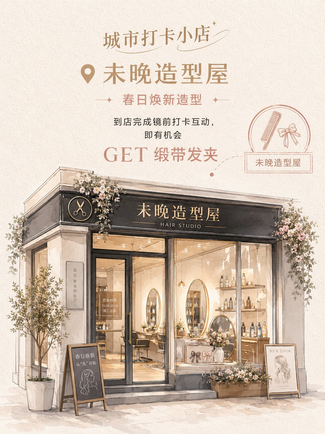
整体风格为半写实手绘 + 精致水彩建筑插画 + 门店活动海报。画面不是普通照片滤镜,也不是潦草草稿,而是将真实门店改造成温柔、精致、适合打卡传播的手绘海报。

画面采用“上方信息区 + 下方门店主视觉”的竖版结构。顶部放品牌 / 系列标题,中上部放店名、主题文案和活动信息。若为活动引流版,突出“GET + 礼品 / 权益”;若为氛围展示版,则弱化营销信息,突出门店气质。

右侧或局部可加入圆形印章、小图标、地图点位虚线、标签框或手写注释,增强打卡海报感。

下半部分为基于上传照片改造后的门店主视觉。门店要保留真实结构,同时变得更精致、更温柔、更有打卡感。门头、招牌、橱窗、玻璃门、室内陈列和门口装饰要清楚。

配色不要固定成单一粉色,而要根据门店类型选择浅色、时尚、柔和的配色。整体低到中低饱和、明度偏高,有女性向、小资、年轻化、生活方式感。背景使用米白、奶白、暖灰或浅卡其纸张纹理。

装饰元素必须符合门店类型:
花店可用花束、藤蔓、花篮、丝带;
造型屋可用发夹、梳子、镜子、护发产品;
咖啡甜品店可用咖啡杯、蛋糕、面包、菜单黑板;
香氛店可用香水瓶、蜡烛、礼盒、试香台;
美甲美睫店可用甲油瓶、睫毛刷、色卡、小镜子;
轻珠宝店可用首饰托盘、耳饰架、戒指盒、珍珠;
女装买手店可用衣架、包包、试衣镜、橱窗陈列。

最终效果应像一张温柔、精致、半现实、适合社交媒体传播的真实门店打卡海报。门店是主角,文字简洁清楚,整体不要硬广告感,要有“想去打卡、想进店、想拍照”的吸引力。
Based on the store photo I uploaded, generate a vertical 3:4 "Semi-realistic Hand-drawn Store Check-in Poster."

Brand / Series Title: [__________]
Store Name: [__________]
Store Type: [__________]
Poster Mode: [Event Traffic Version / Atmosphere Display Version]
Store Theme: [__________]
Main Copy: [__________]
Benefits / Gifts / Experience Content: [__________]
Main Color: [__________]
Secondary Color: [__________]
Accent Color: [__________]
Store Style Direction: [__________]
Industry Decorative Elements: [__________]

Please use the real store photo I uploaded as the core reference; do not reinvent a store. The main identifying features of the original store must be retained, including the store facade, signage position, door and window structure, entrance relationship, shop window position, and overall architectural proportions. You can moderately beautify the storefront, optimize the color scheme, add decorations, improve window displays and the atmosphere at the entrance, but do not change the store into a completely different building.

The overall style is semi-realistic hand-drawn + exquisite watercolor architectural illustration + store event poster. The image is not a common photo filter, nor a messy sketch, but a transformation of a real store into a gentle, exquisite hand-drawn poster suitable for check-in and social sharing.

The layout adopts a vertical structure of "top information area + bottom store main visual." The top contains the Brand / Series Title, and the upper-middle part contains the Store Name, theme copy, and event information. If it is an Event Traffic Version, highlight "GET + Gift / Benefit"; if it is an Atmosphere Display Version, weaken marketing information and highlight the store's temperament.

A circular seal, small icons, map location dotted lines, label boxes, or handwritten notes can be added to the right side or locally to enhance the check-in poster feel.

The lower half is the main visual of the store based on the transformed uploaded photo. The store must retain its real structure while becoming more exquisite, gentler, and more "instagrammable." The storefront, signage, windows, glass doors, interior displays, and doorway decorations must be clear.

The color scheme should not be fixed to a single pink but should be selected based on the store type: light-colored, fashionable, and soft. The overall saturation is low to medium-low, and the brightness is high, with a feminine, petit bourgeois, youthful, and lifestyle feel. The background uses off-white, milky white, warm gray, or light khaki paper texture.

Decorative elements must match the store type:
Flower shops can use bouquets, vines, flower baskets, ribbons;
Styling houses can use hair clips, combs, mirrors, hair care products;
Coffee and dessert shops can use coffee cups, cakes, bread, menu blackboards;
Fragrance shops can use perfume bottles, candles, gift boxes, scent testing stations;
Nail and eyelash salons can use nail polish bottles, eyelash brushes, color cards, small mirrors;
Light jewelry shops can use jewelry trays, earring racks, ring boxes, pearls;
Women's fashion boutiques can use hangers, bags, fitting mirrors, window displays.

The final effect should be like a gentle, exquisite, semi-realistic store check-in poster suitable for social media sharing. The store is the protagonist, the text is concise and clear, and the overall feel should not be a hard advertisement but have the attraction of "wanting to check-in, wanting to enter the store, and wanting to take photos."