请基于以下用户输入创建一个高质量的“概念叙事极简标志”:

[品牌名称 / 项目名称]
[副标题 / 产品名称]
[行业 / 类别]
[品牌定位]
[核心概念]
[隐喻基调]
[情感基调]
[主色调]
[强调色]
[宽高比]

【用户输入】
品牌名称 / 项目名称:[__________]
副标题 / 产品名称:[__________]
行业 / 类别:[创意工作室 / 视觉实验室 / 编辑项目 / 独立时尚品牌 / 艺术空间 / 出版 / 建筑 / 音乐厂牌 / 文化品牌 / 实验项目 / 等]
品牌定位:[__________]
核心概念:[梦境 / 控制 / 距离 / 孤立 / 轨道 / 自由 / 结构 / 记忆 / 叙事 / 想象力 / 张力 / 未来 / 等]
隐喻基调:[宇航员 / 轨道 / 兔耳 / 剪影 / 木偶 / 盒子 / 线条 / 月亮 / 手 / 几何结构 / 虚空 / 物体 / 等]
情感基调:[安静 / 克制 / 诗意 / 冷峻 / 实验性 / 神秘 / 智慧 / 未来感 / 极简 / 概念性 / 等]
主色调:[黑色 / 白色 / 灰色 / 深褐色 / 炭灰色 / 等]
强调色:[少量红色 / 柔和的红色 / 微妙的高光 / 无]
宽高比:[1:1 / 4:3 / 3:2]

【创意目标】
设计一个“概念叙事极简标志”。
这不是一个传统的商业标志,不是装饰性徽章,也不是通用的几何图标。
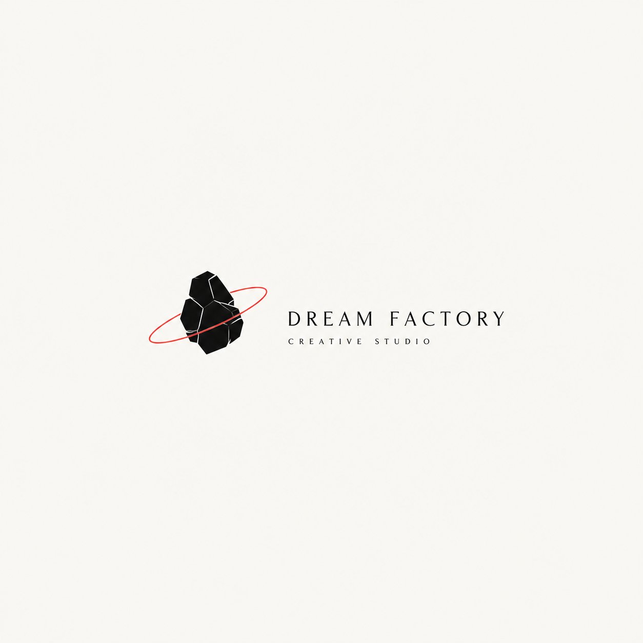
目标是创建一个感觉像是一个微小视觉创意的标志:极简、安静且由概念驱动。

结果应表达“少即是多”的理念:
更少的装饰,更多的意义;
更少的噪音,更多的概念;
更少的视觉杂乱,更多的叙事张力。

【核心定义】
这类标志应使用:
- 极少数的视觉元素,
- 强烈的负空间感,
- 清晰的象征或隐喻关系,
- 克制的排版,
- 以及微妙的叙事或概念层。

它应该给人一种属于独立创意工作室、艺术指导品牌、实验项目或设计驱动的识别系统的标志感。

【基本原则】
1. 标志必须极简,但不能空洞。
2. 图形必须简单,但不能通用。
3. 符号应承载隐喻、暗示或概念意义。
4. 构图应使用大量的留白和负空间。
5. 标志应感觉安静、有意为之且经过艺术指导。
6. 排版应克制、智慧且经过精心布置。
7. 整体设计应感觉像是一个微小的视觉陈述,而不是大声的广告。
8. 避免不必要的装饰。

【图形方向】
基于 [核心概念] 和 [隐喻基调] 创建一个极简的象征性图形或一个微小的叙事视觉场景。

图形可能包括:
- 简化的剪影,
- 一个象征性的物体,
- 人物与结构之间超现实的关系,
- 微小的轨道或轨迹,
- 抽象的类似装置的形式,
- 具有叙事暗示的几何场景,
- 暗示一个想法而非直接描绘它的隐喻构图。

图形应当:
1. 简单且高度凝练;
2. 避免过多的细节;
3. 承载象征或诗意意义;
4. 暗示故事、关系或情感状态;
5. 感觉是概念性的而非仅仅是装饰性的。

【排版方向】
排版必须极简且受控。
要求:
1. 品牌名称应清晰易读。
2. 排版应感觉冷静、现代且深思熟虑。
3. 可以是大写、小型大写字母、窄无衬线体或其他克制的现代风格。
4. 文字应支撑符号,而不是压倒它。
5. 文字与图形之间的关系应感觉是有意且经过策划的。
6. 如果需要,可以添加极少量的副标题 / 次要文本。
7. 避免过于表现化、俏皮或响亮的字体。

【构图方向】
整体构图应强调静止与空间。
要求:
1. 使用大量的空白空间。
2. 保持主标志在画框内相对较小。
3. 符号可以位于左侧、中心或右侧,但整体平衡必须感觉精致。
4. 构图应感觉像是一个身份展示或画廊般的陈列。
5. 如果有帮助,可以使用小的注释、细线或微妙的结构对齐。
6. 避免使其感觉像海报、贴纸页 or 广告。

【颜色方向】
保持色调克制。
推荐方法:
- 黑色、白色、灰色、炭灰色或深中性色作为主调;
- 可选择性地添加极少量的红色、柔和的红色或其他微妙的强调色;
- 强调色应作为张力点、切割线、轨道、线条或信号起作用;
- 绝不要让强调色主导设计;
- 避免丰富的渐变和高饱和度的配色方案。

【氛围与美学】
最终标志应感觉:
- 极简
- 概念性
- 叙事性
- 诗意
- 克制
- 智慧
- 艺术指导感
- 独立
- 实验性
- 少即是多

【应避免的内容】
请严格避免:
1. 通用的公司标志;
2. 装饰性的徽章标志;
3. 可爱的吉祥物标志;
4. 没有意义的过度几何化的抽象标记;
5. 沉重的装饰;
6. 拥挤的构图;
7. 类似海报的布局;
8. 彩色或嘈杂的设计;
9. 任何感觉通用、大声或商业上过度解释的东西。

【输出要求】
生成一个高质量的“概念叙事极简标志”,通过极简的形式、强烈的负空间和安静但有意义的象征性姿态来传达清晰的想法。

最终结果应感觉像:
一个有故事的标志,
一个带有张力的符号,
以及一个建立在“少即是多”原则上的视觉识别系统。
Please create a high-quality “Conceptual Narrative Minimal Logo” based on the following user inputs:

[Brand Name / Project Name]
[Subtitle / Product Name]
[Industry / Category]
[Brand Positioning]
[Core Concept]
[Metaphorical Motif]
[Emotional Tone]
[Primary Color]
[Accent Color]
[Aspect Ratio]

【User Input】
Brand Name / Project Name: [__________]
Subtitle / Product Name: [__________]
Industry / Category: [creative studio / visual lab / editorial project / independent fashion label / art space / publishing / architecture / music label / cultural brand / experimental project / etc.]
Brand Positioning: [__________]
Core Concept: [dream / control / distance / isolation / orbit / freedom / structure / memory / narrative / imagination / tension / future / etc.]
Metaphorical Motif: [astronaut / orbit / rabbit ears / silhouette / marionette / box / thread / moon / hand / geometric structure / void / object / etc.]
Emotional Tone: [quiet / restrained / poetic / cold / experimental / mysterious / intelligent / futuristic / minimal / conceptual / etc.]
Primary Color: [black / white / gray / dark brown / charcoal / etc.]
Accent Color: [small amount of red / muted red / subtle highlight / none]
Aspect Ratio: [1:1 / 4:3 / 3:2]

【Creative Goal】
Design a “Conceptual Narrative Minimal Logo”.
This is not a conventional commercial logo, not a decorative badge, and not a generic geometric icon.
The goal is to create a logo that feels like a small visual idea: minimal, quiet, and concept-driven.

The result should express the idea of “less is more”:
less decoration, more meaning;
less noise, more concept;
less visual clutter, more narrative tension.

【Core Definition】
This type of logo should use:
- a very small number of visual elements,
- a strong sense of negative space,
- a clear symbolic or metaphorical relationship,
- restrained typography,
- and a subtle narrative or conceptual layer.

It should feel like a logo that belongs to an independent creative studio, an art-directed brand, an experimental project, or a design-led identity system.

【Essential Principles】
1. The logo must be minimal, but not empty.
2. The graphic must be simple, but not generic.
3. The symbol should carry metaphor, implication, or conceptual meaning.
4. The composition should use a lot of breathing room and negative space.
5. The logo should feel quiet, intentional, and art-directed.
6. Typography should be restrained, intelligent, and carefully placed.
7. The overall design should feel like a small visual statement, not a loud advertisement.
8. Avoid unnecessary decoration.

【Graphic Direction】
Create a minimal symbolic graphic, or a small narrative visual scene, based on the [Core Concept] and [Metaphorical Motif].

The graphic may include:
- a simplified human silhouette,
- a symbolic object,
- a surreal relationship between a figure and a structure,
- a small orbit or trajectory,
- an abstract device-like form,
- a geometric scene with narrative implication,
- a metaphorical composition that suggests an idea rather than directly illustrating it.

The graphic should:
1. be simple and highly distilled;
2. avoid excessive detail;
3. carry symbolic or poetic meaning;
4. suggest a story, relation, or emotional state;
5. feel conceptual rather than merely decorative.

【Typography Direction】
Typography must be minimal and controlled.
Requirements:
1. The brand name should be clear and readable.
2. Typography should feel calm, modern, and deliberate.
3. It can be uppercase, small caps, narrow sans serif, or another restrained modern style.
4. Text should support the symbol, not overpower it.
5. The relationship between text and graphic should feel intentional and curated.
6. Subtitle / secondary text may be added in a very small amount if needed.
7. Avoid overly expressive, playful, or loud type.

【Composition Direction】
The overall composition should emphasize stillness and space.
Requirements:
1. Use a lot of empty space.
2. Keep the main logo relatively small within the frame.
3. The symbol can sit left, center, or right, but the overall balance must feel refined.
4. The composition should feel like an identity presentation or a gallery-like display.
5. Small annotations, thin lines, or subtle structural alignments may be used if helpful.
6. Avoid making it feel like a poster, sticker sheet, or advertisement.

【Color Direction】
Keep the palette restrained.
Recommended approach:
- black, white, gray, charcoal, or deep neutral tones as the main palette;
- optionally add a very small amount of red, muted red, or another subtle accent color;
- the accent color should function as a point of tension, cut, orbit, line, or signal;
- never let the accent color dominate the design;
- avoid rich gradients and high-saturation color schemes.

【Mood & Aesthetic】
The final logo should feel:
- minimal
- conceptual
- narrative
- poetic
- restrained
- intelligent
- art-directed
- independent
- experimental
- less-is-more

【What to Avoid】
Please strictly avoid:
1. generic corporate logos;
2. decorative badge logos;
3. cute mascot logos;
4. overly geometric abstract marks with no meaning;
5. heavy ornament;
6. crowded compositions;
7. poster-like layouts;
8. colorful or noisy designs;
9. anything that feels generic, loud, or commercially over-explained.

【Output Requirement】
Generate one high-quality “Conceptual Narrative Minimal Logo” that communicates a clear idea through minimal form, strong negative space, and a quiet but meaningful symbolic gesture.

The final result should feel like:
a logo with a story,
a symbol with tension,
and a visual identity built on the principle that less is more.