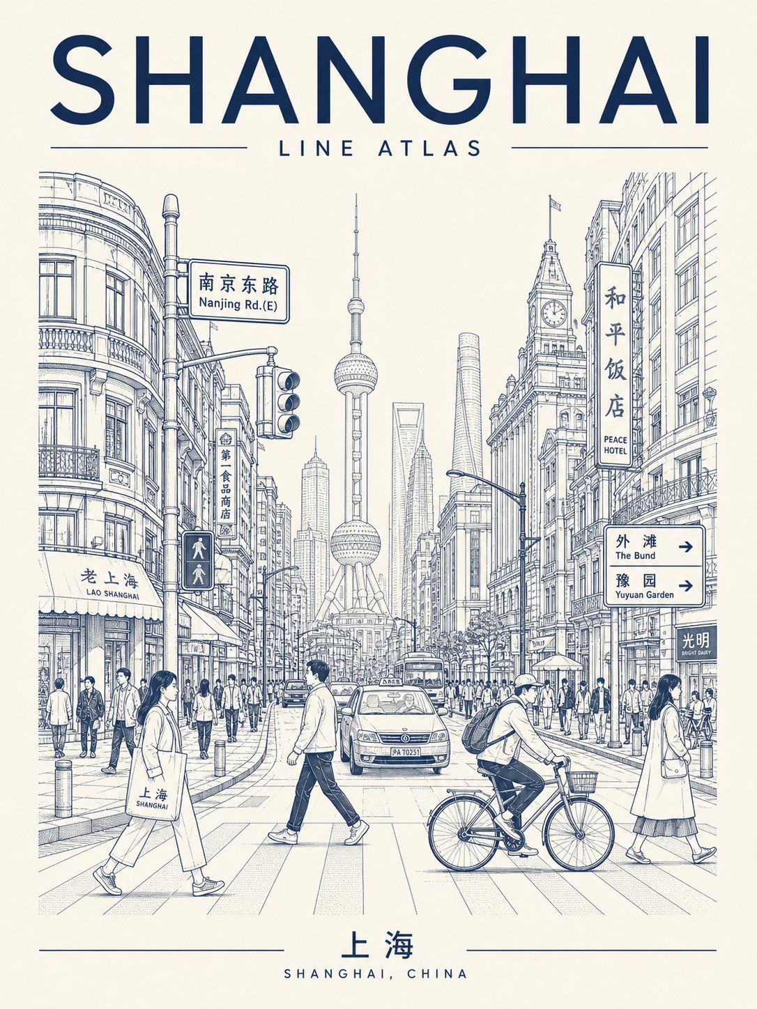
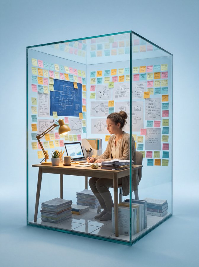
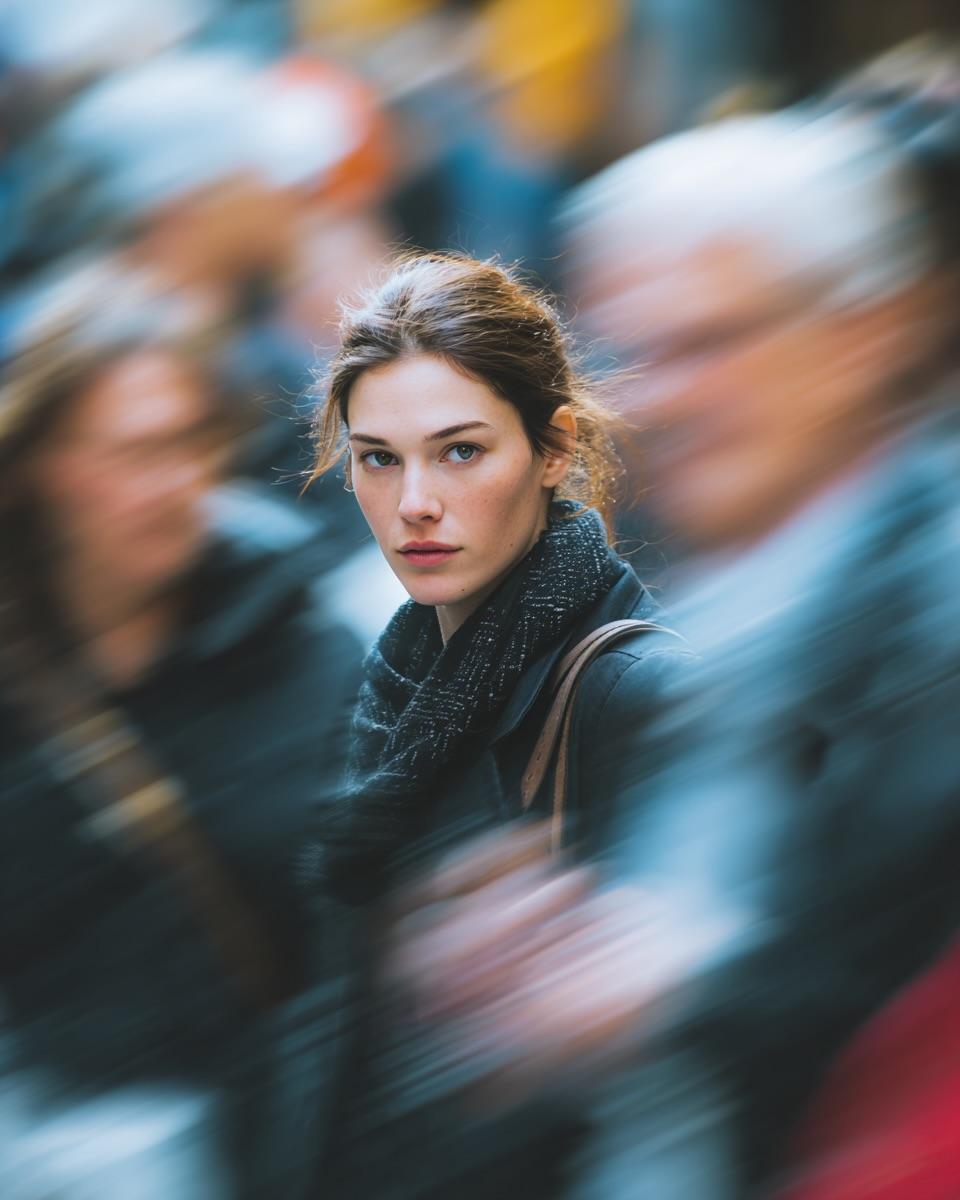
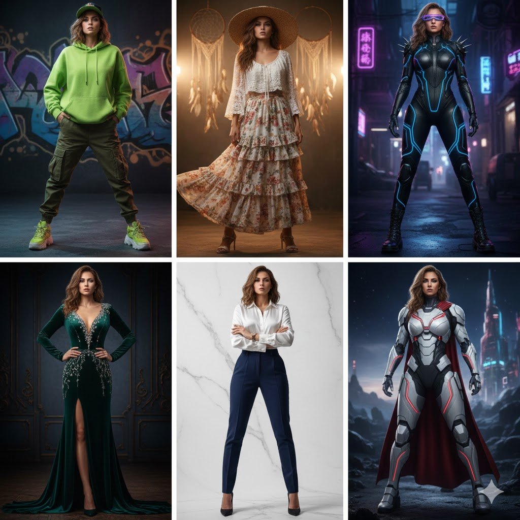
请生成一张高完成度的「城市线描图鉴海报 / Urban Line Atlas Poster」。

这张图是基于“单色城市线描旅行海报”的视觉语言进行设计。顶部大标题、中部街景纵深、核心地标、左右建筑、前景人物、底部落款的视觉骨架和具体构图。

【主题城市】
城市名称:【城市名】
英文主标题:【英文城市名或自定义标题,例如 TOKYO RHYTHM / SHIBUYA PULSE / URBAN LINE ATLAS】
中文 / 本地语言标题:【中文或当地语言名称】
国家 / 地区:【国家或地区】
核心地标:【代表性地标】
街区场景:【具体街区或街道氛围】
情绪主题:【通勤清晨 / 雨后街口 / 周末午后 / 黄昏骑行 / 夜前城市漫步】
主色调:【朱红 / 黑灰 / 深靛蓝 / 墨绿 / 茶褐 / 酒红】
画幅比例:【3:4竖版 / 2:3竖版】

【整体定位】
这是一张兼具旅行纪念海报、城市视觉图鉴、建筑线描手稿和编辑设计封面的作品。它不应该像普通旅游宣传图,也不应该只是地标插画,而应该像一张高级城市档案:既有城市识别度,又有真实街头生活感。

【构图设计】
1. 顶部为强标题区,主标题醒目,可以使用大字号英文标题,也可以加入城市代码、系列编号、经纬度、街区名称或副标题,形成原创命名系统。
2. 中部为城市街景主体,采用街道纵深透视。视角可以是正中轴,也可以是轻微斜角、略微俯视或前景框景,避免与参考图完全一致。
3. 核心地标作为远景或中景视觉锚点,要清晰可识别,但不要像旅游广告一样过度突出,要融入日常街景。
4. 左右两侧加入本地建筑立面、商铺、路牌、交通灯、地铁入口、公交站、广告牌、街灯、电线、橱窗等细节,形成高密度城市信息。
5. 前景加入自然人物和生活元素,例如通勤者、骑自行车的人、游客、学生、咖啡杯、购物袋、出租车、小摊、行李箱等,让画面有城市生活气。
6. 底部设置独立落款区,可以设计成城市标签、旅行票据、档案编号、地图索引或城市图鉴说明,不要完全照搬参考图的底部排版。

【文字系统】
顶部主标题必须准确清晰。底部城市名、国家名或系列名必须清晰。画面中只保留2–4处较大的可读路牌或街区文字,其余小招牌使用抽象的本地文字笔画或装饰性字符,避免乱码和错别字。文字要像设计系统的一部分,而不是随意贴上去。

【视觉风格】
单色或极少量双色线描风格,背景为米白、暖白或浅灰纸张质感。线条精密、干净、克制,有建筑手稿感、钢笔线稿感、丝网印刷感和城市图鉴感。主要建筑线条略重,远景线条略轻,人物和小物件简洁但可辨认。

【创新要求】
请主动在以下至少三个方面做微创新:
- 标题命名方式
- 标题排版位置
- 底部落款结构
- 街景视角
- 地标位置
- 人物动态
- 色彩系统
- 城市信息模块
- 局部留白设计

【避免事项】
不要生成普通旅游海报,不要水彩,不要厚涂,不要卡通Q版,不要赛博朋克,不要大面积彩色,不要廉价纪念品风。

请生成一张独立完整、高清、线条清晰、具有收藏感和系列化辨识度的竖版城市线描海报。
Generate a high-fidelity "Urban Line Atlas Poster." The design is based on the visual language of a monochrome urban line-drawing travel poster, featuring a visual framework consisting of a top title, middle streetscape depth, core landmarks, flanking buildings, foreground figures, and a bottom footer.

[Theme City Details]
- City Name: [Insert Name]
- Main English Title: [e.g., TOKYO RHYTHM / SHIBUYA PULSE / URBAN LINE ATLAS]
- Local Language Title: [Chinese or native name]
- Country/Region: [Location]
- Core Landmark: [Representative landmark]
- Street Scene: [Specific neighborhood or atmosphere]
- Mood Theme: [Commuter morning / Rainy street / Weekend afternoon / Sunset cycling / Twilight walk]
- Color Palette: [Vermilion / Black-gray / Deep indigo / Dark green / Umber / Burgundy]
- Aspect Ratio: [3:4 or 2:3 vertical]

[Positioning]
This is a hybrid of a travel memorial, urban visual atlas, architectural manuscript, and editorial cover. It should feel like a high-end urban archive rather than a generic tourist brochure—combining city recognition with authentic street-life vitality.

[Composition]
1. Top Title Area: Bold and striking English titles, potentially including city codes, series numbers, coordinates, or subheadings.
2. Middle Streetscape: Deep perspective view. The angle can be centered, slightly tilted, or a high-angle view to ensure a unique composition.
3. Visual Anchor: Core landmarks should be recognizable in the mid or background, integrated naturally into the daily street scene.
4. High-Density Details: Flanking buildings should feature local facades, shops, road signs, traffic lights, subway entrances, and wires.
5. Human Elements: Include natural foreground elements like commuters, cyclists, tourists, coffee cups, or taxis to add a sense of life.
6. Footer: A standalone area designed like a city tag, travel receipt, or archive index.

[Typography & Style]
Text must be crisp and integrated into the design system. Use monochrome or minimal duotone line-drawing style on paper textures (cream/light gray). Lines should be precise and restrained, resembling architectural pen sketches or screen prints.

[Innovation & Constraints]
Please innovate in title placement, street perspective, and information modules. Avoid: Watercolors, thick painting, cartoon/chibi styles, cyberpunk, large color blocks, or cheap souvenir aesthetics. Generate a high-definition, clean-lined, collectible vertical urban poster.