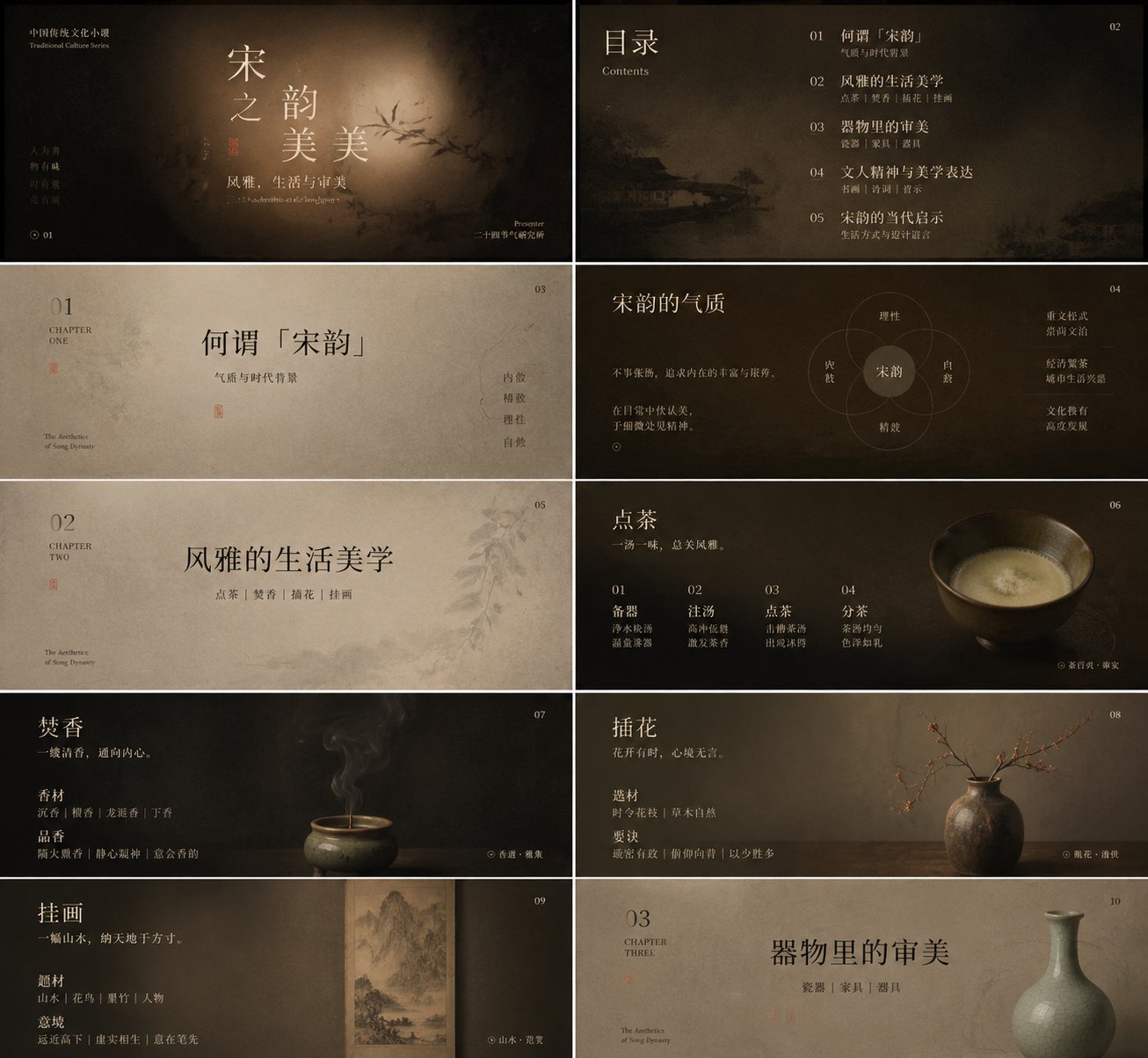
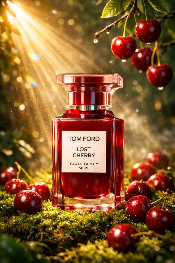
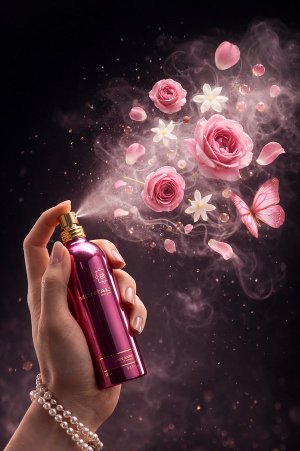
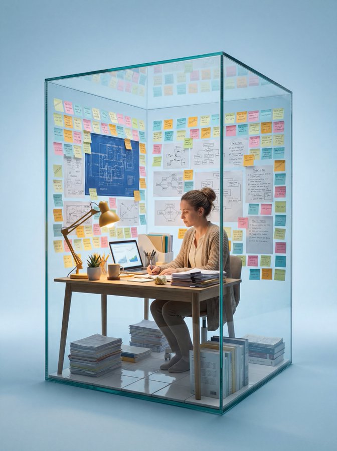
请把这套美学转化为一种可迁移的视觉生成方式:画面不靠清晰物件抢夺注意,而让主体、信息或产品像从一块温润、被时间浸泡过的材质中慢慢显影。整体保持低饱和、低噪声、柔焦的深浅层次,背景可以是木纹、纸纤维、皮革、陶土、烟雾、织物、岩面、食物肌理、数据底图或抽象空间,但都要呈现可触摸的厚度、微弱的旋转感和边缘暗部,让中心像被一束克制的漫射光轻轻托出。不要做模板化海报,也不要让装饰比内容更大声;所有元素都应像自然沉积出来,安静、成熟、含蓄而有记忆点。

文字是画面的主要造型力量。中文标题要有细长、清瘦、带呼吸感的宋体或书卷气质,字距略松,行距留出空气,允许词语被拆开、错位、分层排列,让文字块像一组漂浮的标本或落叶,不必完全对齐,却要有内在秩序。英文、数字、注释和小标签使用更轻的衬线体或窄体字,作为节奏停顿和旁注,面积很小但位置精确。主标题与副标题之间形成大小、语言和明暗的对照:大的中文承担情绪和诗性,小的英文或数字承担说明、时间、类别、排行、指标、来源或轻微的理性回声。可以加入一个极简的象征图形、线条、叶片、点、徽记或数据标记,作为视觉转折,不要做可爱图标,也不要抢走文字的重量。

色彩系统以“深色空气 + 温润主体 + 低亮文字 + 小面积语义点睛”来组织。保留参考图的琥珀褐、焦糖棕、烟黑、米白之间的明暗关系和柔软边界,但彩色部分要根据实际内容改变角色:知识、报告、金融、科技主题可让点睛色更冷、更清洁、更像微光标注;食物、生活方式、节气、文化主题可让它更温热、更有油润或纸感;医疗、环保、公益主题可让它更干净、更淡、更有呼吸;商业发布或封面主题可让它更锋利、更集中,只占极小面积。背景的大色面始终克制,强调色不要扩散成满屏装饰,而是在标题交界、重点数字、图例、标签、按钮或视觉焦点附近承担情绪转折。文字颜色以象牙白、旧纸白、淡灰金或雾面浅色为主,暗部保留细节,避免纯黑纯白的硬切。

版式采用中心凝聚、四周低声补充的秩序。画面中央可以放标题、核心数据、产品轮廓、人物姿态、图表结论或主要视觉物,周围留出被暗部包裹的缓慢空间;上方保留少量品牌、系列名、章节名或短句,两侧可放括号式注释,底部用极细分隔线、短英文、脚注、来源、指标说明或一行密集小字压住画面,使作品既像封面又像一页高级报告。阅读路径从中心大字进入,经过图形或重点色短暂停顿,再落到底部信息层;密度从中心向边缘递减,边缘信息要小、稳、准。用于图表和排行时,让数据像被收进这种沉静材质里,重点数字变成诗性标题的一部分;用于PPT或报告时,让章节标题、关键结论和辅助说明形成柔和但清晰的层级;用于产品、人物、食物、建筑或自然对象时,抓住轮廓、材质、阴影和留白,而不是复制原图题材。现在把这种美学用于我的实际内容,让画面自然长成它需要的形式。

本次主题:你规划一个适合这个提示词风格的知识的选题,然后围绕这个制作ppt 课件,最好是中国某个传统文化 小方向上的选题。

最少要10张图片
Convert this aesthetic into a transferable visual generation style: The composition should not rely on clear objects to grab attention; instead, allow the subject, information, or product to slowly emerge from a warm, time-worn texture. Maintain a low-saturation, low-noise, soft-focus depth throughout. The background can be wood grain, paper fiber, leather, clay, smoke, fabric, rock surfaces, food texture, data base maps, or abstract spaces, but all must present a tactile thickness, a subtle sense of rotation, and dark edges, making the center appear as if gently lifted by a restrained, diffused light. Avoid template-like posters and do not let decoration overpower the content; all elements should appear as if naturally deposited—quiet, mature, subtle, and memorable.

Text is the primary shaping force of the image. The Chinese title should have a slender, lean, breathable Song typeface or bookish temperament, with slightly loose letter spacing and air in the line spacing. Allow words to be split, misaligned, or layered, making the text blocks look like a group of floating specimens or fallen leaves—not perfectly aligned, but possessing an internal order. Use lighter serif or narrow fonts for English, numbers, notes, and small labels as rhythmic pauses and marginalia; small in area but precise in position. Form a contrast in size, language, and light/dark between the main title and subtitle: large Chinese characters bear emotion and poetic quality; small English or numbers bear explanation, time, category, ranking, indicators, sources, or a slight rational echo. A minimalist symbolic graphic, line, leaf, dot, emblem, or data marker can be added as a visual turning point; do not create cute icons, and do not steal the weight of the text.

Organize the color system with 'dark air + warm subject + low-light text + small-area semantic highlights.' Retain the light-dark relationships and soft boundaries of the reference image's amber brown, caramel brown, smoky black, and rice white, but the colored parts should change roles according to the actual content: for knowledge, reports, finance, and technology themes, make the accent colors colder, cleaner, and more like shimmer annotations; for food, lifestyle, solar terms, and cultural themes, make them warmer, more oily, or paper-like; for medical, environmental, and public welfare themes, make them cleaner, paler, and more breathable; for commercial releases or cover themes, make them sharper and more concentrated, occupying only a tiny area. Large color surfaces in the background should always be restrained; do not let accent colors spread into full-screen decoration, but rather assume emotional shifts near title junctions, key figures, legends, labels, buttons, or visual focal points. Text colors should be ivory white, old paper white, pale gray-gold, or misty light colors; retain details in dark areas, avoiding hard cuts of pure black or white.

The layout adopts an order of central concentration with quiet surroundings. The center of the image can hold titles, core data, product outlines, human postures, chart conclusions, or main visual objects, with a slow space wrapped in dark areas left around it; keep a small amount of brand, series name, chapter name, or short sentences at the top, place bracketed notes on the sides, and use ultra-fine dividing lines, short English, footnotes, sources, indicator explanations, or a line of dense small text at the bottom to hold down the image, making the work resemble both a cover and a high-level report. The reading path enters from the large central text, pauses briefly at the graphic or accent color, and then falls to the bottom information layer; density decreases from the center to the edges; edge information should be small, stable, and accurate. When used for charts and rankings, let the data be absorbed into this quiet texture, with key numbers becoming part of the poetic title; when used for PPT or reports, let chapter titles, key conclusions, and auxiliary notes form a soft but clear hierarchy; when used for products, figures, food, architecture, or natural objects, capture the outline, material, shadow, and negative space, rather than copying the original subject matter. Now, apply this aesthetic to my actual content, and let the image naturally grow into the form it requires.

Theme: Plan a knowledge topic suitable for this prompt style and create a PPT presentation around it, preferably focusing on a specific sub-direction of traditional Chinese culture. Minimum 10 images.