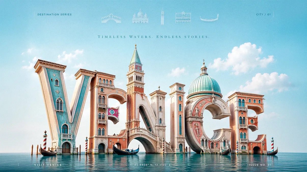
为[CITY]创作一张比例为3:2的高级3D文字旅行海报,融合了奢华社论目的地广告风格与写实的雕塑字母建筑。

城市名称“[CITY]”必须是核心主体,占据画面的大部分。将字母构建为巨大的、写实的、三维雕塑形式,材质可选择亮面喷漆、抛光陶瓷、软石膏、雕刻石材、阳光照射的建筑表面或城市特有的建筑材料。每个字母都应具象化为城市的特征:地标、天际线剪影、拱门、塔楼、圆顶、桥梁、窗户、阳台、文化纹样或街道细节,必须直接从字母形态中生长出来。

地标应在建筑结构上与字母融为一体,而不是粘贴在文字背后或周围。塔楼可以从垂直的笔画中升起,桥梁可以连接两个字母,圆顶可以构成圆弧字母的曲线,屋顶可以塑造顶部边缘,窗户或装饰细节可以嵌入字母表面。

采用低角度四分之三透视镜头,使字体显得宏伟、电影感、高端且亲切。将3D城市名称雕塑放置在画面中央偏下的位置,填满中部和底部,上方保留充足的留白。

在顶部页眉处,添加一排精致的水平淡化地标符号(与该城市相关):微型矢量图标或半透明的建筑符号。保持其柔和、优雅且处于次要地位,类似于高端杂志的页眉细节。在每个图标下方添加地标名称。整体保持淡雅与高级感。

移除左上角任何可见的太阳。使用明亮的自然日光,左上方设有柔和的主光,配合温和的补光、洁净的高光、细微的环境光遮蔽以及字母下方的柔和接触阴影。光影应感觉愉悦、清新且具社论质感,而非昏暗或过度电影化。

根据[CITY]使用明亮的城市适配色调:沿海城市使用水蓝色、珊瑚色、奶油色和阳光黄;历史名城使用温暖的石材色、赤陶色、橄榄绿和柔和的天蓝色;热带城市使用青绿色、芒果黄、棕榈绿和白色;山地城市使用阿尔卑斯蓝、草地绿、雪白和金暖色;夜生活城市使用紫罗兰色、青色、桃色和琥珀色。色彩保持干净、乐观、高端且受控。

添加微妙的社论文本元素以提升海报质感:
例如“DESTINATION SERIES”等微型大写页眉文字、像“CITY / 01”这样的微小位置代码、精致的垂直分隔线、极简的页脚行如“VISIT [CITY]”,以及靠近底部的微型坐标或期号。这些文字元素必须保持安静且次要,以确保巨大的3D城市名称始终是主角。

背景应保持干净宽敞,仅包含柔和天空渐变、细腻云朵或抽象色块。不要在背景中放置额外的地标;所有的主要城市特征必须来自字体本身,顶部淡化的符号页眉除外。

风格:高端旅行社论广告、奢侈杂志封面、写实3D字体雕塑、明亮的现代乐观主义、愉悦的旅行向往、文化认同、洁净的艺术指导。

负面提示词:避免平庸的旅行海报、零散的地标拼贴、粘贴在文字背后的地标、扁平化字体、杂乱的背景、左上角可见的太阳、过多的图标、昏暗的电影照明、浑浊的颜色、廉价纪念品美学、难以辨认的城市名称、扭曲的字母、随机的渐变、嘈杂的纹理、库存模板布局以及装饰过度的旅游图表。
Create a 3:2 premium 3D typography-based travel poster for [CITY], using luxury editorial destination advertising fused with realistic sculptural letterform architecture.

The city name “[CITY]” must be the dominant subject, occupying most of the canvas. Build the letters as large, realistic, three-dimensional sculptural forms made from glossy painted material, polished ceramic, soft plaster, carved stone, sunlit architectural surfaces, or city-adaptive materials. Each letter should physically transform into the city’s identity: landmarks, skyline silhouettes, arches, towers, domes, bridges, windows, balconies, cultural patterns, coastal forms, or street details must grow directly out of the letterforms.

Landmarks should feel architecturally integrated, not pasted behind or around the word. A tower may rise from a vertical stem, a bridge may connect two letters, a dome may form the curve of a rounded letter, rooftops may shape the top edges, and windows or ornamental details may be embedded into the letter faces.

Use a low-angle three-quarter camera view so the typography feels monumental, cinematic, premium, and friendly. Place the 3D city-name sculpture slightly low in the frame, filling the central and lower portions of the poster, with generous negative space above.

At the top header, add a refined horizontal row of faded landmark symbols related to the city: tiny vector icons, or translucent architectural glyphs. Keep them very soft, elegant, and secondary, like premium magazine header details.  Add each landmark name below its icon. Keep all faded and premium.

Remove any visible sun from the top-left corner. Use bright natural daylight with a soft key light from the upper-left, gentle fill light, clean highlights, subtle ambient occlusion, and soft contact shadows beneath the letters. The lighting should feel cheerful, fresh, and editorial, not dark or overly cinematic.

Use a bright city-adaptive palette based on [CITY]: coastal cities use aqua, coral, cream, and sunny yellow; historic cities use warm stone, terracotta, olive, and soft sky blue; tropical cities use turquoise, mango, palm green, and white; mountain cities use alpine blue, meadow green, snow white, and golden warmth; nightlife cities use violet, cyan, peach, and amber. Keep colors clean, optimistic, premium, and controlled.

Add subtle editorial text elements to improve the poster:
small uppercase header text such as “DESTINATION SERIES”, a tiny location code like “CITY / 01”, delicate vertical divider lines, a minimal footer line such as “VISIT [CITY]”, and small microtype coordinates or issue number near the bottom edge. These text elements must remain quiet and secondary so the large 3D city name stays the hero.

Background should be clean and spacious with a soft sky gradient, delicate clouds, or abstract color field only. Do not place extra landmarks in the background; all major city identity must come from the typography itself, except the faded symbolic header row.

Style: premium editorial travel advertising, luxury magazine cover, realistic 3D typographic sculpture, bright modern optimism, cheerful wanderlust, cultural identity, clean art direction.

Negative prompt: avoid generic travel posters, separate landmark collages, landmarks pasted behind text, flat typography, cluttered backgrounds, visible sun in the top-left corner, excessive icons, dark cinematic lighting, muddy colors, cheap souvenir aesthetics, unreadable city name, distorted letters, random gradients, noisy textures, stock-template layouts, and overdecorated tourist graphics.