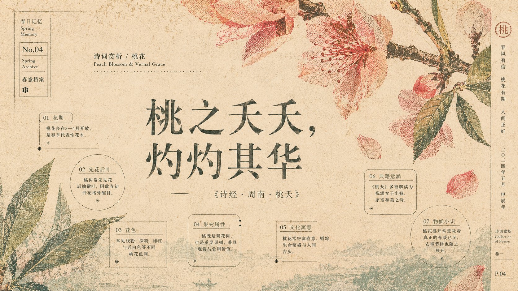
为【主题】设计一张高级东方编辑海报 / 文化视觉海报 / 节气海报 / 文学封面式海报。整体不要做成普通干净插画,而要做成一种“被时间、纸张、空气和旧印刷共同留下的视觉残影”。

画面的核心亮点是:使用与【主题】相关的巨大象征物剪影,例如【主题象征物】,让这些剪影从画面上方、下方或边缘大幅度裁切进入画面。不要完整展示物体,而是只展示局部、边缘、轮廓和被截断的形态,让图形像从画面之外自然侵入,产生高级、克制、留白丰富的构图张力。

这些剪影不能是干净的矢量图,也不能是普通插画。必须把它们处理成半调网点、丝网印刷颗粒、旧报纸网纹、risograph 复古印刷质感、破损油墨、漏印、错位套色、纸纤维侵蚀、边缘毛糙、局部褪色、局部断裂的效果。图形要像被印在旧纸上很多年后留下的残影,而不是刚刚画出来的图案。

构图采用“上下气候分层”的方式。画面上半部分使用偏暖色的图形处理,例如锈红、赭石、枯叶橙、旧朱砂、焦糖棕、暗橘色,用来表现【主题】中的外在情绪、热度、记忆、生命力、成熟感或历史感。画面下半部分使用偏冷色的图形处理,例如浅青、雾蓝、灰绿、冷青灰、淡水蓝、稀释蓝,用来表现【主题】中的内在情绪、空气、水汽、距离、寂静、梦境、回声或精神性。

背景不能是纯白。背景必须是温润旧纸质感,使用米白、象牙白、浅米黄、亚麻白、旧书页色作为底色,带有细微纸纹、横向纤维、轻微污痕、褪色颗粒、印刷压痕、旧海报磨损感。所有颜色都要像被纸张吸收过,低饱和、柔和、干燥、略微褪色,不能鲜艳发光,不能有现代数码渐变感。

画面中央或视觉重心处保留大面积呼吸感留白,用来放置【主题】主标题。主标题要成为画面的精神锚点,字体可以根据主题选择:东方题材使用宋体、碑刻感字体、书法感字体或现代中文刊物标题字体;现代题材可使用克制的衬线体、编辑杂志字体或极简标题字体。文字颜色不要纯黑,使用墨绿、灰绿、深茶色、旧墨色、褪色棕色,使文字也像印刷在纸上。

文字排版要有编辑设计感:主标题大而克制,副标题小而精致,可加入英文译名、日期、短句说明、竖排文字、边栏信息、编号、脚注式说明、图鉴式小字。小字不要喧宾夺主,要像旧书页、植物档案、诗集封面、展览海报上的说明文字。文字与图形之间要形成呼吸关系,不能拥挤。

画面需要有“纸上气候”的感觉:图形不是装饰,而是空气、温度、时间、记忆、情绪在纸上的沉积。暖色部分像阳光、火焰、秋叶、历史、生命余温;冷色部分像露水、雾气、河流、夜色、沉默、内心回声。上下色彩之间不需要硬分割,而是通过留白、纸纹、半调网点密度和色彩稀释自然过渡。

整体风格参考:东亚节气海报、复古丝网印刷、risograph 海报、旧书封面、植物档案图谱、诗集装帧、民艺印刷、旧报纸半调网点、日式季节海报、现代东方编辑设计。画面要有高级设计感、收藏感、文化感、纸张触感、时间感和克制的诗意。

避免:不要做成普通商业插画,不要干净矢量图,不要过度写实,不要塑料质感,不要霓虹色,不要高饱和渐变,不要卡通风,不要过度复杂背景,不要把主体完整居中摆放,不要让文字像后期贴上去。

最终画面应该像一张被时间保存下来的主题印刷物:巨大裁切的象征物在上下边缘形成冷暖对照,中间留白承托标题,纸纹、网点、漏印和褪色让整张画具有旧纸、气候、记忆和诗意残影的高级质感。

——————

本次是诗词赏析主题:欲买桂花同载酒,终不似少年游
你要给出对应花知识点 至少5个 相关不同存在逻辑和样式的信息点

同样逻辑给出 一共4次,每次都是不同的关于花朵的知名诗句

每张图片配色色相截然不同

比例16:9
Design a high-end Oriental editorial poster / cultural visual poster / solar term poster / literary cover-style poster for [Theme]. The overall style should not be a common clean illustration, but rather a "visual afterimage left behind by time, paper, air, and old printing."

The core highlight of the visual is: use large silhouettes of symbolic objects related to [Theme], such as [Theme Symbolic Objects], and let these silhouettes cut into the frame significantly from the top, bottom, or edges. Do not display the objects in full; instead, show only fragments, edges, contours, and truncated forms, letting the graphics naturally invade from outside the frame, creating a high-end, restrained compositional tension rich in white space.

These silhouettes cannot be clean vector graphics or ordinary illustrations. They must be processed with halftone dots, screen printing grain, old newspaper textures, Risograph retro printing textures, damaged ink, ink leakage, misaligned color registration, paper fiber erosion, rough edges, partial fading, and partial fracture effects. The graphics should look like afterimages left on old paper after many years, rather than patterns just drawn.

The composition adopts an "upper and lower climate layering" method. The upper part of the image uses warm-toned graphic processing, such as rust red, ochre, withered leaf orange, old cinnabar, caramel brown, and dark orange, to express external emotions, heat, memory, vitality, maturity, or a sense of history in [Theme]. The lower part uses cool-toned graphic processing, such as light cyan, mist blue, grayish green, cool bluish-gray, pale water blue, and diluted blue, to express internal emotions, air, water vapor, distance, silence, dreams, echoes, or spirituality in [Theme].

The background cannot be pure white. The background must be a warm old paper texture, using cream, ivory white, light beige, linen white, or old book page colors as the base, with subtle paper grain, horizontal fibers, slight stains, faded particles, printing indentations, and a sense of old poster wear. All colors should look as if they have been absorbed by the paper, low-saturation, soft, dry, and slightly faded, not bright or glowing, and without modern digital gradients.

Keep a large area of "breathing" white space at the center or visual center of gravity for placing the [Theme] main title. The main title should become the spiritual anchor of the visual. The font can be selected based on the theme: Songti, stela-style fonts, calligraphic fonts, or modern Chinese magazine title fonts for Oriental themes; restrained serif fonts, editorial magazine fonts, or minimalist title fonts for modern themes. The text color should not be pure black; use dark green, grayish green, dark tea color, old ink color, or faded brown to make the text also look printed on paper.

The typography should have an editorial design feel: the main title large yet restrained, the subtitle small and exquisite. English translations, dates, short sentence descriptions, vertical text, sidebar information, numbers, footnote-style explanations, and catalog-style small text can be added. Small text should not overpower the main subject; it should be like the explanatory text on old book pages, botanical archives, poetry collection covers, or exhibition posters. A breathing relationship must be formed between the text and graphics, avoiding crowding.

The visual needs a sense of "climate on paper": the graphics are not decorations but the deposition of air, temperature, time, memory, and emotion on paper. The warm parts are like sunlight, flames, autumn leaves, history, and the residual warmth of life; the cool parts are like dew, mist, rivers, night, silence, and inner echoes. There is no need for a hard division between the upper and lower colors; instead, they transition naturally through white space, paper grain, halftone dot density, and color dilution.

Overall style references: East Asian solar term posters, retro screen printing, Risograph posters, old book covers, botanical archival maps, poetry book binding, folk art printing, old newspaper halftone dots, Japanese seasonal posters, modern Oriental editorial design. The visual should have a high-end sense of design, collectability, cultural depth, paper texture, a sense of time, and restrained poetry.

Avoid: Do not make common commercial illustrations, no clean vector graphics, no excessive realism, no plastic texture, no neon colors, no high-saturation gradients, no cartoon styles, no overly complex backgrounds, do not place the main subject completely centered, and do not make the text look like it was pasted on later.

Final visual should be like a theme printed matter preserved by time: huge cropped symbolic objects forming warm-cool contrast at top and bottom edges, white space in the middle supporting the title, and paper grain, dots, ink leakage, and fading giving the entire image a high-end texture of old paper, climate, memory, and poetic afterimages.

——————

This session is for a poetry appreciation theme: "Want to buy osmanthus and carry wine together, but it's no longer like a youth's outing."
You must provide at least 5 relevant knowledge points about flowers with different logic and style information points.

Follow the same logic a total of 4 times, each time with different famous poetry lines about flowers.

The color scheme for each image must be distinctly different.

Aspect ratio 16:9.