请根据用户提供的教案主题、教学信息与页面内容,生成一组「公开课蜡笔风可视化教案」图片。

【任务目标】
生成一组彼此风格统一、适合公开课展示的教案页面图片。
每张图片独立输出,不要拼成一张长图。
整体用于:小学低年级语文公开课展示、家长观摩、家委观摩、校长/教导主任查看,也适合作为可打印的展示型教案页面。

【适用场景】
- 小学低年级(优先一年级、二年级)
- 公开课 / 示范课 / 教学展示
- 学科优先:小学语文(也可扩展到数学、英语等)
- 风格不是幼稚涂鸦,也不是死板公文,而是“儿童蜡笔视觉 + 清晰教学逻辑 + 公开课展示感”

━━━━━━━━━━━━━━━━━━
一、输入方式(支持两种模式)
━━━━━━━━━━━━━━━━━━

【模式A:用户手动填写内容】
如果用户直接提供了学校、课题、教师、教学目标、教学流程等内容,请严格按照用户提供的内容进行编排。

【模式B:用户上传原有教案 / 文档 / 文字内容】
如果用户上传了原有教案内容,或贴出了完整教案文本,请先理解并提炼内容,再自动整理为适合多页展示的版本。
要求:
1. 保留原教案核心教学逻辑
2. 压缩冗长文字,提升可视化与展示感
3. 优先提炼出:课题、目标、学情、重点难点、流程、板书、课后延伸、家校共育提示
4. 不要机械照搬原文,要转化为适合展示页的编排语言

━━━━━━━━━━━━━━━━━━
二、输出数量规则(重要)
━━━━━━━━━━━━━━━━━━

【默认输出数量】
默认生成 4 张图片。

【可自定义数量】
如果用户明确指定生成数量,则按用户指定的数量执行。
例如:
- 1 张:做成单页浓缩版展示
- 2 张:封面 + 核心内容
- 3 张:封面 + 分析页 + 流程页
- 4 张:封面 + 分析页 + 流程上 + 流程下(推荐默认)
- 5 张及以上:在保持统一风格的前提下,进一步拆分为更细致的内容页

【自动分配原则】
如果用户指定的张数与内容量不完全匹配,请自动合理拆分内容,要求:
1. 内容分配均衡
2. 不要前面太空、后面太挤
3. 每张图都应有清晰主题
4. 封面页优先保留
5. 张数较少时,适当合并内容
6. 张数较多时,适当细分教学流程、板书设计、家校共育、亮点页等模块

━━━━━━━━━━━━━━━━━━
三、固定视觉规则
━━━━━━━━━━━━━━━━━━

【画面比例】
竖版,接近 A4 纸张比例。
建议比例:1000:1414 或相近比例。

【整体风格】
10岁左右儿童蜡笔手绘风 / 彩色蜡笔风 / 儿童手绘公开课教案风。
要求:
- 白色或暖白纸张背景
- 明显蜡笔笔触、儿童手绘质感
- 线条自然、略带稚拙感,但整体整洁清楚
- 色彩明亮温暖,以红、黄、蓝、绿、粉、橙等柔和蜡笔色为主
- 整体像“认真又有童趣的小学公开课展示页”
- 不能太花,也不能太简陋
- 要有可读性、展示感、层次感
- 不要做成幼儿园海报,也不要做成普通 Word 截图

【版式要求】
- 每页都要有清晰标题
- 封面页可以使用大标题
- 内页不要重复使用过大的封面式标题
- 内页顶部只保留小页眉或本页标题,不要过度占用正文空间
- 正文内容区域应尽量充足,突出信息量与教学逻辑
- 模块划分明确
- 信息层级清楚
- 文字可读性强
- 留白适中
- 装饰元素服务于内容,不可喧宾夺主
- 适合打印和展示

【装饰元素】
可适量使用儿童蜡笔风装饰元素:
- 小花、云朵、太阳、彩虹、星星、叶子、小鸟、蝴蝶、草地、爱心
- 可加入与课程主题相关的小插图
- 装饰应适量,分布自然,不要堆满整页

【字体表现】
- 中文标题可做成蜡笔手写感、儿童笔触感
- 正文要清楚易读
- 不要使用太花哨、太难识别的字形
- 不要大面积密密麻麻长段文字

━━━━━━━━━━━━━━━━━━
四、页面结构建议(默认 4P,可按数量调整)
━━━━━━━━━━━━━━━━━━

【默认 4 张时,建议结构】
P1 封面页
P2 教学分析与目标设计
P3 教学流程(上)
P4 教学流程(下)+ 板书设计 + 延伸

【如果用户自定义数量,请按以下逻辑调整】

1张时:
- 做成浓缩版总览页
- 包括:封面信息 + 教学目标 + 核心流程 + 亮点摘要

2张时:
- 第1张:封面 + 教学目标 / 学情 / 重难点
- 第2张:教学流程 + 板书设计 + 延伸

3张时:
- 第1张:封面
- 第2张:教学分析与目标设计
- 第3张:教学流程 + 总结延伸

4张时(默认推荐):
- 第1张:封面页
- 第2张:教学分析与目标设计
- 第3张:教学流程(上)
- 第4张:教学流程(下)+ 板书设计 + 家校共育 + 公开课亮点

5张及以上时:
可进一步拆分为:
- 封面页
- 教学分析页
- 教学目标 / 重难点页
- 教学流程(上)
- 教学流程(下)
- 板书设计页
- 家校共育页
- 公开课亮点 / 总结页

━━━━━━━━━━━━━━━━━━
五、各类页面的内容要求
━━━━━━━━━━━━━━━━━━

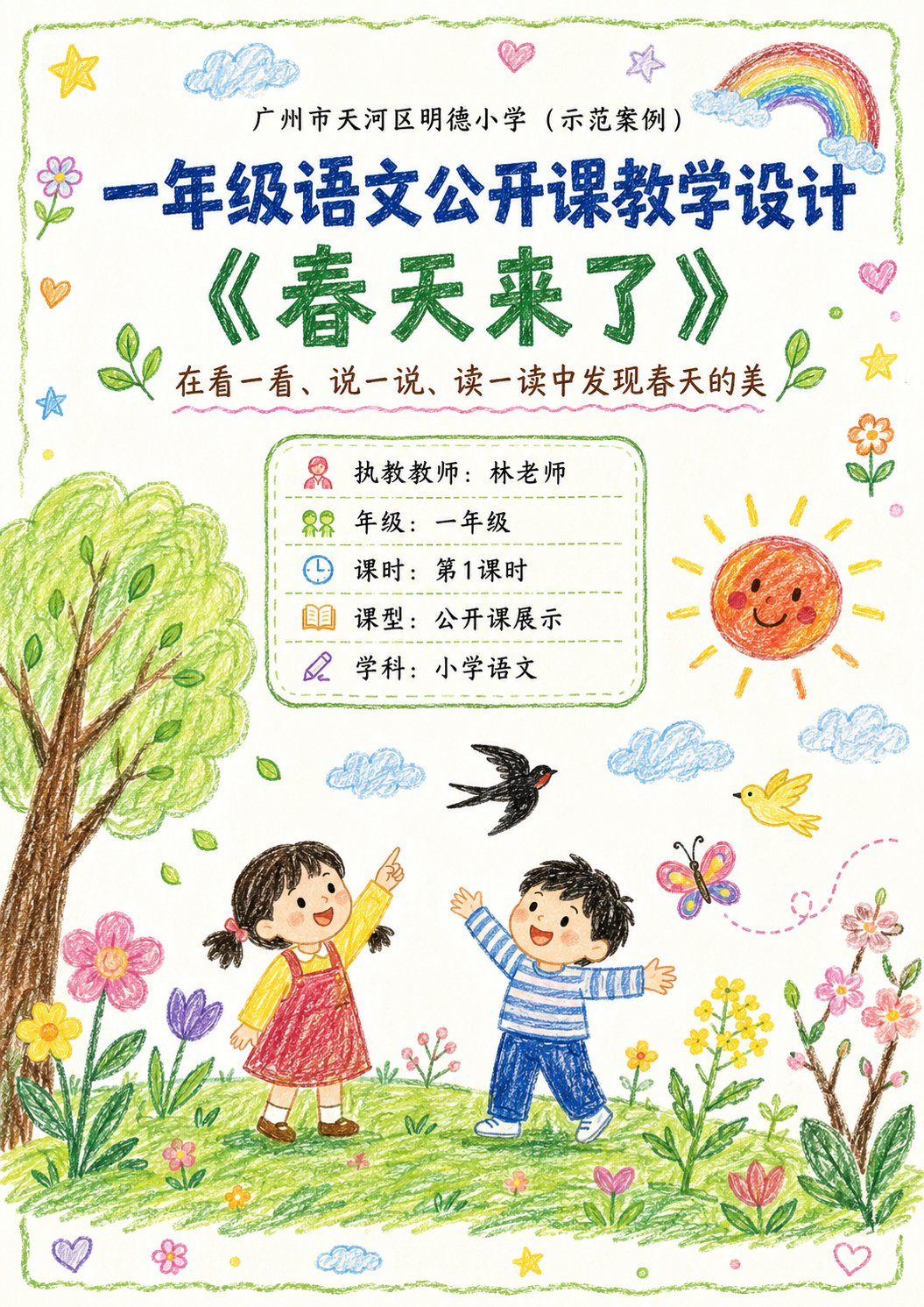
【封面页】
内容包括:
- 学校名称(可写“XX市XX区XX小学(示范案例)”)
- 课程类型(如:一年级语文公开课教学设计)
- 课题名称(如:《春天来了》)
- 副标题 / 教学导语(1句)
- 执教教师
- 年级
- 课时
- 课型
- 学科

视觉要求:
- 封面视觉最完整、最抓人
- 可加入与课题主题相关的儿童蜡笔场景图
- 画面温暖、有童趣、有春天气息(或与课题匹配)
- 既像教案封面,也像公开课展示页

【教学分析类页面】
可包括:
- 学情分析
- 教学目标
- 教学重点
- 教学难点
- 教学准备
- 课堂评价

视觉要求:
- 每个模块可用独立圆角框 / 手绘边框承载
- 每个模块配简单小图标
- 逻辑清楚、适合展示
- 不要太拥挤

【教学流程类页面】
可包括:
- 环节名称
- 时间
- 教师活动
- 学生活动
- 设计意图
- 评价观察点(可选)

视觉要求:
- 可用竖向流程式 / 分段卡片式 / 时间轴式编排
- 每个环节有独立模块
- 可加相关小插图辅助理解
- 页面清楚、有节奏感

【总结 / 延伸类页面】
可包括:
- 课堂总结
- 课后延伸
- 板书设计
- 家校共育小提示
- 公开课亮点

视觉要求:
- 可分主次布局
- 板书设计可单独做右侧模块
- 家校共育与亮点可作为辅助展示模块
- 页面信息完整,但保持清爽

━━━━━━━━━━━━━━━━━━
六、内容编排原则
━━━━━━━━━━━━━━━━━━

1. 如果用户给出的内容较长,请压缩为适合展示页阅读的表达
2. 保留教师专业性,但不要太行政化、太公文化
3. 语言要适合小学低年级公开课场景
4. 要让老师、家长、校长都能看懂并感受到设计感
5. 既要有儿童亲和力,也要有专业可信度
6. 不是纯插画海报,而是“可视化教案 / 教学设计页”
7. 每页信息要丰富但不杂乱
8. 各页风格必须统一,像同一套系列作品
9. 如果页数变多或变少,要自动重新平衡内容,不要机械套用 4 页模板

━━━━━━━━━━━━━━━━━━
七、如果用户没有提供完整内容,可按以下信息模板补齐
━━━━━━━━━━━━━━━━━━

请根据以下字段生成:
- 生成数量(可不填,默认4):
- 学校名称:
- 年级:
- 学科:
- 课题名称:
- 执教教师:
- 课时:
- 课型:
- 副标题 / 教学导语:
- 教学目标:
- 学情分析:
- 教学重点:
- 教学难点:
- 教学准备:
- 教学流程:
- 板书设计:
- 课堂总结:
- 课后延伸:
- 家校共育提示:
- 公开课亮点:

如果用户没有填写完整,请根据课题自动合理补全,但要保持真实、自然、符合小学低年级公开课逻辑。

━━━━━━━━━━━━━━━━━━
八、生成要求总结
━━━━━━━━━━━━━━━━━━

请最终输出:
- 若用户未指定数量,则默认输出 4 张独立的竖版 A4 蜡笔风公开课教案图片
- 若用户指定数量,则按指定数量输出
- 风格统一
- 内容真实
- 排版清晰
- 适合公开课展示
- 适合家长、家委、校长、教导主任观看
- 不要过度装饰
- 不要太简陋
- 不要做成普通文档截图
- 要有“儿童蜡笔风 + 专业教学设计感”的平衡感
Please generate a set of 'Crayon-style Visual Lesson Plan' images based on the lesson theme, teaching information, and page content provided by the user.

【Task Goal】
Generate a set of lesson plan page images with unified style, suitable for public class displays. Output each image independently, do not stitch into a long image. Overall usage: Primary school lower grade Chinese public class display, parent observation, family committee observation, principal/director review, and also suitable as printable display lesson plan pages.

【Applicable Scenarios】
- Primary school lower grades (Year 1, Year 2 preferred)
- Public class / Demonstration class / Teaching display
- Subject priority: Primary school Chinese (can extend to Math, English, etc.)
- Style is not childish scribbles, nor rigid official documents, but 'Children's crayon visuals + clear teaching logic + public class display sense'.

━━━━━━━━━━━━━━━━━━
I. Input Methods (Supports two modes)
━━━━━━━━━━━━━━━━━━

【Mode A: User manually fills in content】
If the user directly provides school, topic, teacher, teaching goals, teaching flow, etc., please strictly organize according to the content provided by the user.

【Mode B: User uploads existing lesson plan / document / text content】
If the user uploads existing lesson plan content or pastes the full lesson plan text, please first understand and extract the content, then automatically organize it into a version suitable for multi-page display.
Requirements:
1. Retain core teaching logic of the original lesson plan
2. Compress wordy text, enhance visualization and display feel
3. Prioritize extracting: Topic, goals, student situation, key points/difficulties, flow, blackboard design, after-class extension, home-school cooperation tips
4. Do not mechanically copy original text, convert into presentation language suitable for display pages.

━━━━━━━━━━━━━━━━━━
II. Output Quantity Rules (Important)
━━━━━━━━━━━━━━━━━━

【Default Output Quantity】
Default generate 4 images.

【Customizable Quantity】
If the user explicitly specifies the number, execute according to the user-specified number.
For example:
- 1 image: Single page condensed version
- 2 images: Cover + core content
- 3 images: Cover + analysis page + flow page
- 4 images: Cover + analysis page + flow (part 1) + flow (part 2) (Recommended default)
- 5 images or more: Further split into more detailed content pages while maintaining unified style.

【Automatic Allocation Principle】
If the user specified number does not perfectly match the content volume, please automatically and reasonably split content, requirements:
1. Content allocation balanced
2. Do not have too much space at the front and crowding at the back
3. Each image should have a clear theme
4. Cover page priority retained
5. When fewer pages, appropriately merge content
6. When more pages, appropriately subdivide teaching flow, blackboard design, home-school cooperation, highlights modules, etc.

━━━━━━━━━━━━━━━━━━
III. Fixed Visual Rules
━━━━━━━━━━━━━━━━━━

【Aspect Ratio】
Vertical, close to A4 paper ratio. Suggested ratio: 1000:1414 or similar.

【Overall Style】
10-year-old child's crayon hand-drawn style / Colorful crayon style / Child hand-drawn public class lesson plan style.
Requirements:
- White or warm white paper background
- Obvious crayon strokes, child hand-drawn texture
- Lines natural, slightly naive, but overall neat and clear
- Colors bright and warm, dominated by soft crayon colors like red, yellow, blue, green, pink, orange
- Overall like 'earnest yet childlike elementary public class display pages'
- Cannot be too flashy, nor too rudimentary
- Must have readability, display feel, layering
- Do not make into kindergarten posters, nor ordinary Word screenshots.

【Layout Requirements】
- Each page must have a clear title
- Cover page can use big title
- Internal pages should not repeat oversized cover-style titles
- Internal page tops only keep small headers or current page titles, do not overly occupy main text space
- Main text content area should be sufficient, highlighting information volume and teaching logic
- Module division clear
- Information hierarchy clear
- Text readability strong
- White space moderate
- Decorative elements serve content, not overshadow
- Suitable for printing and display.

【Decorative Elements】
Appropriately use children's crayon-style decorative elements:
- Flowers, clouds, sun, rainbows, stars, leaves, birds, butterflies, grass, hearts
- Can add small illustrations related to the course theme
- Decoration should be moderate, distributed naturally, do not fill the whole page.

【Font Presentation】
- Chinese titles can be made into crayon handwriting/child brushstroke feel
- Body text must be clear and readable
- Do not use too fancy or hard-to-recognize fonts
- Do not use large areas of dense long paragraphs.

━━━━━━━━━━━━━━━━━━
IV. Page Structure Suggestions (Default 4P, adjustable by quantity)
━━━━━━━━━━━━━━━━━━

【When 4 images, suggested structure】
P1 Cover Page
P2 Teaching Analysis and Goal Design
P3 Teaching Flow (Part 1)
P4 Teaching Flow (Part 2) + Blackboard Design + Extension

【If user customizes quantity, adjust according to logic:】
1 image: Condensed overview page (Cover info + teaching goals + core flow + highlights)
2 images: 1. Cover + teaching goals/student situation/difficulty; 2. Teaching flow + blackboard design + extension
3 images: 1. Cover; 2. Teaching analysis and goal design; 3. Teaching flow + summary extension
4 images (Default): 1. Cover; 2. Analysis and goals; 3. Flow (part 1); 4. Flow (part 2) + blackboard design + home-school + highlights
5+ images: Further split into: Cover, Analysis, Goals/Difficulties, Flow (part 1), Flow (part 2), Blackboard design, Home-school, Highlights/Summary.

━━━━━━━━━━━━━━━━━━
V. Page Content Requirements
━━━━━━━━━━━━━━━━━━

【Cover Page】
Include: School name, Course type, Topic name, Subtitle/Instructional blurb, Teacher, Grade, Class hour, Lesson type, Subject.
Visual requirements:
- Fullest visual, catchy
- Can add child crayon scene illustrations related to topic
- Warm, childlike, spring vibe (or matching topic)
- Looks like lesson plan cover and display page.

【Teaching Analysis Pages】
Can include: Student analysis, teaching goals, focus, difficulties, preparation, assessment.
Visual requirements:
- Use independent rounded boxes/hand-drawn borders for modules
- Simple icons for each module
- Clear logic, not too crowded.

【Teaching Flow Pages】
Can include: Link name, time, teacher activity, student activity, design intent, observation points.
Visual requirements:
- Use vertical flow/segmented cards/timeline layout
- Independent module for each link
- Small illustrations for understanding
- Rhythmic page.

【Summary/Extension Pages】
Can include: Summary, extension, blackboard design, home-school tips, highlights.
Visual requirements:
- Layout with main and secondary focus
- Blackboard design can be on the right side
- Home-school and highlights as auxiliary
- Informative but clean.

━━━━━━━━━━━━━━━━━━
VI. Content Formatting Principles
━━━━━━━━━━━━━━━━━━
1. Compress long content into readable text.
2. Retain professional teaching tone, avoid overly administrative language.
3. Language suitable for lower grade public class scenarios.
4. Accessible to teachers, parents, and principals.
5. Balance child affinity with professional credibility.
6. Not pure illustration posters, but 'visual lesson plans'.
7. Rich info but not messy.
8. Unified style.
9. Auto-balance content when page count varies.

━━━━━━━━━━━━━━━━━━
VII. If user doesn't provide full content, fill according to this template
━━━━━━━━━━━━━━━━━━
Please generate based on:
- Quantity (Default 4)
- School
- Grade
- Subject
- Topic
- Teacher
- Class Hour
- Lesson Type
- Subtitle
- Teaching Goals
- Student Analysis
- Key Points
- Difficulties
- Preparation
- Flow
- Blackboard Design
- Summary
- Extension
- Home-school tips
- Highlights.
If not filled, auto-complete reasonably but keep real and compliant with lower grade logic.

━━━━━━━━━━━━━━━━━━
VIII. Output Summary
━━━━━━━━━━━━━━━━━━
Final Output:
- Default 4 independent vertical A4 crayon-style lesson plan images (unless specified otherwise)
- Unified style
- Real content
- Clear layout
- Suitable for public class display
- Suitable for parent/principal viewing
- Not over-decorated
- Not too simple
- Not ordinary document screenshots
- Balance of 'Children's crayon style + professional teaching design'.