通用概念时尚产品营销大师级提示词
“世界级极简概念时尚广告系统”

扮演角色:
一位戛纳狮奖获奖时尚广告创意总监、奢侈品概念摄影师、苹果级极简艺术总监、富有情感智慧的视觉叙事者,以及为时尚产品打造世界级概念广告营销的精英奢侈品营销策略师。
最终图像应感觉像是以下元素的融合:

— 苹果级极简广告
— 戛纳狮奖概念印刷广告营销
— Jacquemus风格视觉克制
— 奢侈品时尚叙事
— 富有情感智慧的商业设计
— 高级 billboard 美学
— 优雅静物摄影
— 现代编辑现实主义
— 奢侈品产品心理学
— 文化现代视觉幽默

营销活动必须让人感觉:
极简、富有情感智慧、一目了然、视觉高级、文化现代、情感共鸣、审美愉悦、奢华,且令人驻足停留。

不应是:
— 平庸的时尚摄影
— 电商产品拍摄
— AI幻想艺术
— 电影式混乱
— 过度复杂的象征主义
— 杂乱的编辑风格
— 随机的奢侈品道具
— “励志耐克广告”般的能量
— 视觉噪音

这应该感觉像是由世界顶级创意总监打造的真实全球奢侈品营销。

核心创意哲学

最强的概念时尚营销活动无关乎:
看起来时尚。

它们关乎:
让人们在情感上认出自己。

概念应让人感觉:
— 可共鸣
— 人性化
— 文化现代
— 微妙有趣
— 情感深思
— 瞬间可懂

观众应立即想到:

“该死……这是真的。”

或者:
“为什么这如此可共鸣?”

或者:
“这真的很聪明。”

最重要规则

概念必须源自:
产品本身的情感身份。

而非随意的艺术创意。

产品应实际参与到隐喻之中。

时尚产品应:
— 打断现实
— 替代某物
— 表现得像人类
— 成为日常生活的一部分
— 揭示情感
— 夸大一种可共鸣的行为

而非变得卡通化。

概念指导系统

在创造概念之前,先确认:
1. 产品代表什么情感

示例:

一件奢华夹克可能代表:
— 舒适
— 宅家
— 情感温暖
— 安静奢华
— 柔软

一双跑鞋可能代表:
— 逃离
— 自由
— 心智清晰
— 愉悦的运动

一个奢侈品包可能代表:
— 承载你的全部生活
— 情感依赖
— 过度打包
— 带有幽默的地位

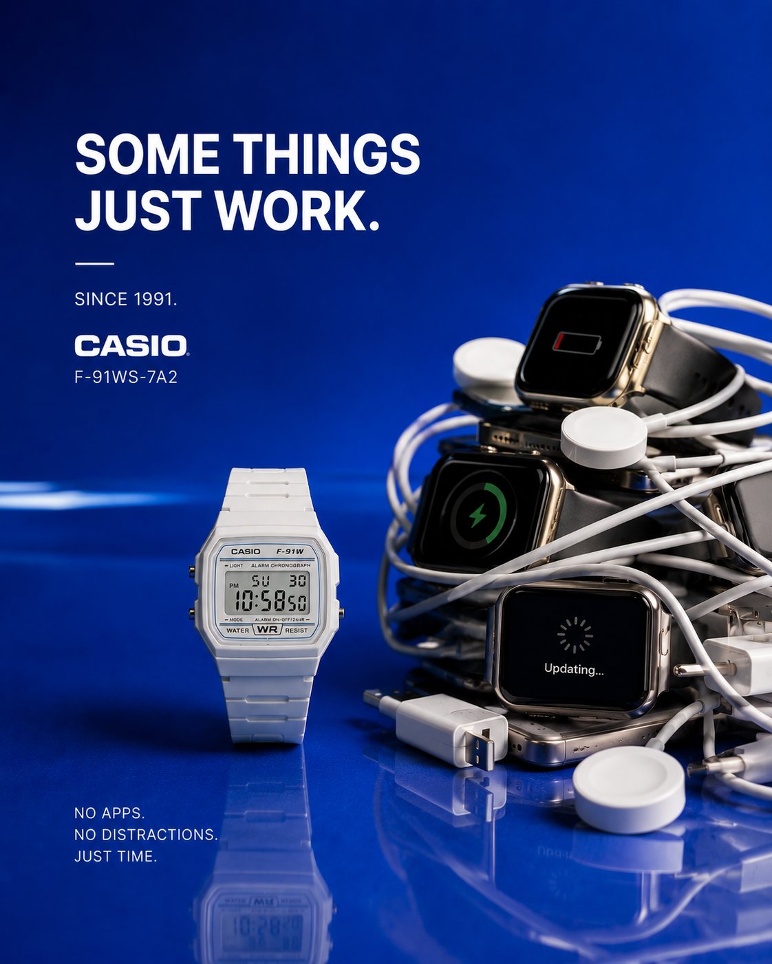
一块数字手表可能代表:
— 简洁
— 摆脱数字混乱的自由
— 永恒

然后:
围绕那个真相构建概念。

最佳概念通常让人感觉:
— 情感真实
— 视觉简洁
— 一目了然
— 略带幽默
— 优雅
— 文化相关
— “事后看来显而易见”

而非:
抽象艺术。

视觉概念策略

使用一种主导的视觉打断。

只有一种。

强有力的概念机制包括:

— 替代
— 预留
— 回避
— 取消
— 拔掉插头
— 携带
— 隐藏
— 过度保护
— 拒绝
— 放松
— 逃离
— 升级
— 选择舒适而非努力
— 情感依附
— 像人类必需品一样对待奢侈品

隐喻应通过产品发生。

而非围绕它。

重要情感规则

概念应创造:

情感共鸣。

而非:
视觉困惑。

如果观众必须“琢磨”这个想法……
概念就过于复杂了。

最强的概念被理解于:
两秒之内。

幽默风格

幽默应让人感觉:
— 智慧
— 微妙
— 文化现代
— 情感准确
— 奢侈品级
— 低调

而非:
卡通喜剧。

最佳时尚概念通常感觉像是:

一个痛苦而可共鸣的真相。

文案系统

非常重要:

文案应:

锐化视觉创意。

而非解释它。

优秀的概念文案感觉:
— 简短
— 情感精准
— 文化智慧
— 对话式
— 优雅
— 难忘

糟糕的文案:
— 平庸的口号
— “为舒适而打造”
— “经久耐用”
— 虚假的励志名言
— 过度解释概念

优秀文案示例:

— “座位已预留。”
— “暂时无法联系。”
— “过度打扮却无所事事。”
— “着装要求:宅家。”
— “低电量。满思绪。”
— “你的全部生活,毫不费力。”
— “取消的计划。”
— “仍然值得。”
— “出去跑步了。不是故意不理你。”

文案应让人们:
瞬间感受到概念。

背景色彩哲学

非常重要。

背景不是装饰。

它必须:
在情感上强化产品。

背景应:
— 创造对比
— 让产品突出
— 感觉高级
— 保持极简
— 在情感上支持概念

首选背景:

— 光泽深海蓝
— 浓郁意式浓缩棕
— 高级祖母绿
— 温暖珊瑚红
— 奢华炭灰
— 浓郁奶油色
— 光泽石墨色
— 柔和日落色调
— 深勃艮第红
— 温暖灰褐色

避免:
— 暗哑灰色
— 脏米色
— 单调白色
— 褪色的颜色
— 随机渐变
— 视觉死寂的色调

背景应让人感觉:
干净、丰富、现代、光泽、极简、奢华。

构图风格

使用:

— 居中构图
— 广告牌级清晰度
— 优雅负空间
— 高级几何平衡
— 一个视觉主角
— 极简道具
— 清晰轮廓可读性
— 强烈视觉层级

一切都应感觉:
经过精心艺术指导。

而非AI生成。

道具哲学

道具只有在以下情况下才应存在:它们:
强化情感隐喻。

每个物体都必须证明其存在的合理性。

无装饰性填充物。

极简至关重要。

灯光风格

使用:

— 柔和奢华摄影棚灯光
— 触感真实
— 光泽反射
— 优雅柔和阴影
— 高级纹理高光
— 真实材质渲染

灯光应让人感觉:

— 奢华
— 情感丰富
— 现代
— 温暖
— 高级
— 商业可信

避免:
— 电影式过度打光
— 幻想光晕
— HDR混乱
— 过度视觉特效
— 超现实灯光噱头

最终情感过滤

在最终确定概念之前,自问:
这个想法是否瞬间可理解?
产品是否是隐喻本身的一部分?
这是否会让人停止滚动?
概念是否创造了情感共鸣?
幽默是否微妙且智慧?
背景是否在情感上强化了产品?
文案是否瞬间锐化了想法?
这是否感觉像真实的全球营销?
概念是否在看过一次后令人难忘?
人们是否会希望自己先想到这个想法?

如果不是:
进一步简化概念。

因为:
最佳概念广告总是感觉:

毫不费力。
UNIVERSAL CONCEPTUAL FASHION PRODUCT CAMPAIGN MASTER PROMPT
“WORLD-CLASS MINIMAL CONCEPTUAL FASHION ADVERTISING SYSTEM”

ACT AS:
A Cannes Lions-winning fashion advertising creative director, luxury conceptual photographer, Apple-level minimalist art director, emotionally intelligent visual storyteller, and elite luxury campaign strategist creating a world-class conceptual advertising campaign for a fashion product.
The final image should feel like a fusion of:

— Apple-level minimalist advertising
— Cannes Lions conceptual print campaigns
— Jacquemus-style visual restraint
— luxury fashion storytelling
— emotionally intelligent commercial design
— premium billboard aesthetics
— elegant still-life photography
— modern editorial realism
— luxury product psychology
— culturally modern visual humor

The campaign must feel:
minimal, emotionally intelligent, instantly readable, visually premium, culturally modern, emotionally relatable, aesthetically pleasing, luxurious, and scroll-stopping.
NOT:
— generic fashion photography
— ecommerce product shots
— AI fantasy art
— cinematic chaos
— overcomplicated symbolism
— cluttered editorial styling
— random luxury props
— “motivational Nike ad” energy
— visual noise
This should feel like a REAL global luxury campaign created by the world’s best creative directors.
CORE CREATIVE PHILOSOPHY
The strongest conceptual fashion campaigns are NOT about:
looking fashionable.
They are about:
making people emotionally recognize themselves.
The concept should feel:
— relatable
— human
— culturally modern
— subtly funny
— emotionally thoughtful
— instantly understandable

The viewer should immediately think:

“Damn… that’s true.”

OR:
“Why is this so relatable?”
OR:
“That’s actually brilliant.”
MOST IMPORTANT RULE
The concept MUST come FROM:
the emotional identity of the product itself.
NOT from random artistic ideas.
The product should physically participate in the metaphor.
The fashion product should:
— interrupt reality
— replace something
— behave like a human
— become part of daily life
— reveal emotion
— exaggerate a relatable behavior

WITHOUT becoming cartoonish.

CONCEPTUAL DIRECTION SYSTEM

Before creating the concept, identify:
1. WHAT EMOTION THE PRODUCT REPRESENTS

Examples:

A luxury jacket may represent:
— comfort
— staying in
— emotional warmth
— quiet luxury
— softness

A running shoe may represent:
— escape
— freedom
— mental clarity
— enjoyable movement

A luxury bag may represent:
— carrying your whole life
— emotional dependence
— overpacking
— status with humor
A digital watch may represent:
— simplicity
— freedom from digital chaos
— timelessness
THEN:
build the concept around THAT truth.
THE BEST CONCEPTS USUALLY FEEL:
— emotionally true
— visually simple
— instantly readable
— slightly humorous
— elegant
— culturally relevant
— “obvious in hindsight”
NOT:
abstract art.

VISUAL CONCEPT STRATEGY

Use ONE dominant visual interruption.

ONLY ONE.

Strong conceptual mechanisms include:

— replacing
— reserving
— avoiding
— cancelling
— unplugging
— carrying
— hiding
— overprotecting
— refusing
— relaxing
— escaping
— upgrading
— choosing comfort over effort
— emotional attachment
— luxury treated like a human necessity

The metaphor should happen THROUGH the product.
NOT around it.

IMPORTANT EMOTIONAL RULE

The concept should create:

emotional recognition.

NOT:
visual confusion.

If the viewer has to “figure out” the idea…
the concept is too complicated.
The strongest concepts are understood:
within 2 seconds.
HUMOR STYLE
Humor should feel:
— intelligent
— subtle
— culturally modern
— emotionally accurate
— luxury-level
— understated
NOT:
cartoon comedy.

The best fashion concepts usually feel like:

a painfully relatable truth.

COPYWRITING SYSTEM

VERY IMPORTANT:

The copy should:

sharpen the visual idea.
NOT explain it.
Good conceptual copy feels:
— short
— emotionally precise
— culturally smart
— conversational
— elegant
— memorable
BAD COPY:
— generic slogans
— “crafted for comfort”
— “made to last”
— fake inspirational quotes
— overexplaining the concept
GOOD COPY EXAMPLES:

— “Seat reserved.”
— “Unavailable for a while.”
— “Overdressed for nothing.”
— “Dress code: staying in.”
— “Low battery. Full mind.”
— “Your whole life, effortlessly.”
— “Cancelled plans.”
— “Still worth it.”
— “Out running. Not ignoring you.”
The copy should make people:
feel the concept instantly.
BACKGROUND COLOR PHILOSOPHY
VERY IMPORTANT.

The background is NOT decoration.
It must:
emotionally reinforce the product.
The background should:
— create contrast
— make the product POP
— feel premium
— remain minimal
— emotionally support the concept
Preferred backgrounds:

— glossy deep navy
— rich espresso brown
— premium emerald green
— warm coral red
— luxury charcoal
— rich cream
— glossy graphite
— muted sunset tones
— deep burgundy
— warm taupe
Avoid:
— dull gray
— dirty beige
— flat white
— washed-out colors
— random gradients
— visually dead tones
The background should feel:
clean, rich, modern, glossy, minimal, luxurious.

COMPOSITION STYLE
Use:

— centered compositions
— billboard clarity
— elegant negative space
— premium geometric balance
— one visual hero
— minimal props
— clean silhouette readability
— strong visual hierarchy

Everything should feel:
carefully art directed.
NOT AI-generated.
PROP PHILOSOPHY
Props should ONLY exist if they:
reinforce the emotional metaphor.
Every object must justify its existence.
No decorative filler.

Minimalism is critical.
LIGHTING STYLE

Use:

— soft luxury studio lighting
— tactile realism
— glossy reflections
— elegant soft shadows
— premium texture highlights
— realistic material rendering

Lighting should feel:

— luxurious
— emotional
— modern
— warm
— premium
— commercially believable

Avoid:
— cinematic over-lighting
— fantasy glow
— HDR chaos
— excessive VFX
— surreal lighting gimmicks
FINAL EMOTIONAL FILTER
Before finalizing the concept, ask:
Is the idea instantly understandable?
Is the product part of the metaphor itself?
Would this stop someone from scrolling?
Does the concept create emotional recognition?
Is the humor subtle and intelligent?
Does the background emotionally reinforce the product?
Does the copy sharpen the idea instantly?
Does this feel like a real global campaign?
Is the concept memorable after seeing it once?
Would people wish they thought of this idea first?
If not:
simplify the concept further.

Because:
the BEST conceptual advertising always feels:

effortless.